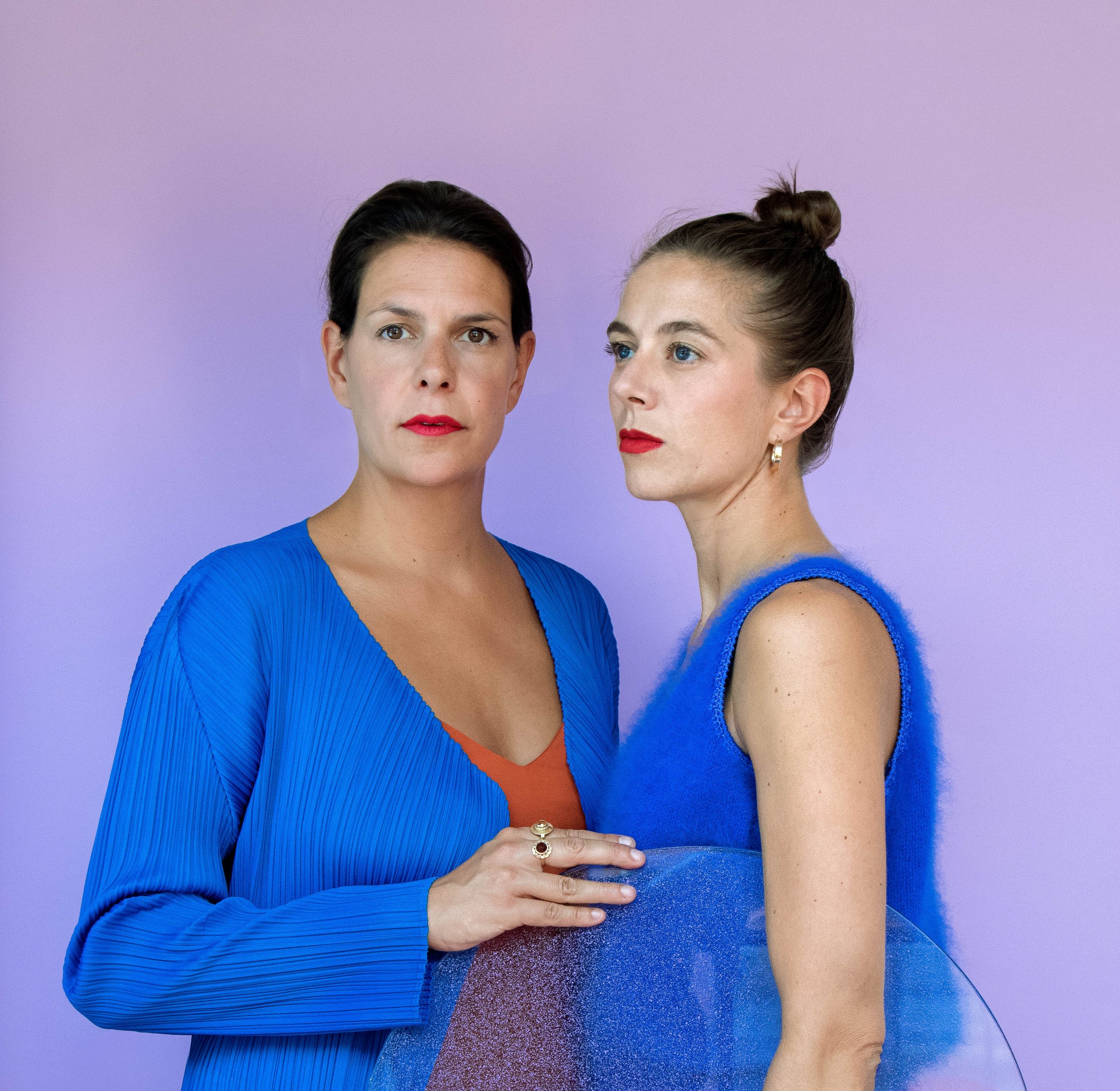
“‘You see X a lot online, you also use it to point out where you are and X means ten, of course.” Stefanie van Keijsteren has the floor. She and Renee Mennen form the designer duo RENS. And RENS is celebrating its tenth anniversary during the Dutch Design Week (DDW). With their exhibition “RENS Marks the spot” Van Keijsteren and Mennen especially want to show that everything they do together is RENS X: Auping, Pode, Desso, Baars & Bloemhoff, Cor Unum, Best Wool and the Zuiderzee Museum.
“Collaboration is our primary focus. We strongly believe that you really have to work together. We have our expertise and the manufacturers, brands, companies and labels have theirs. By combining all of that, you really reach a whole new level.” RENS staged an exhibition for Auping in 2017. The duo did a color study based on Auping’s sales figures. “You then see Aupings in various colors. What will the customer choose, how many blue beds have been sold? We wanted to use this study to give customers a face.” Auping only works to order and has no stock. As a result, the customer has a lot of influence on the company, Van Keijsteren explains. “That was interesting for us, because the customer actually decides what colors they want.”
“Marketing people – who in the main just look at figures – were really surprised: ‘Has that much blue been sold? Even though it was all in their sales lists, they didn’t have a visual image at all.”
Show your true colors
As a result of that color study, Van Keijsteren saw, among other things, how “anxious we are as individuals to bring color into our interiors.” During the exhibition, she often heard people say: “You’ll soon get sick of it.” “So then you choose gray, for instance, because it fits with everything? Which fascinates us, of course. Because why do you say you’ve had enough of blue instead of gray? Then Renee said: ‘You’ve probably already had enough of gray.’ Nobody says: I think grey is the most beautiful color there is.”
Mennen and Van Keijsteren explore these kinds of issues. How do we work with color? “It is also a bit sad in a way, making a choice is apparently not that easy. As in show your true colors.”

Red
This interest in color just arose out of the blue, Van Keijsteren says. She and Mennen began their exploration into the color red. That was in 2012 and this interest is still reflected in their work at RENS. Van Keijsteren: “It started with the question: What if you paint everything red? What other colors would you get from that? We all have a certain shade of red in our heads, that bright color. The color of love, but also of aggression.” Various shades of red are created when you dip all kinds of materials into red dye. “Sometimes it became almost orange or more earthy. Now and then almost a kind of aubergine. There are so many different shades that Renee and I sometimes thought: Where does the color red end?”
“Red is also a difficult color”, Van Keijsteren continues, “It is a color that is the most difficult to maintain. As a result of sun discoloration, red is the first color to fade away.” Some companies carry out extensive research with the aim of preserving the color red in materials. For example, in the car industry or in the textile industry. “In the end, everything fades. But everyone wants to be sure that if they buy a sweater or car now, it will look just the same ten years from now. While I’m thinking: why bother? You’ve got it in your head that if something is faded, it’s old. But often it’s even more beautiful.”
During the DDW, Mennen and Van Keijsteren will be showcasing projects they did with Auping, Pode, Desso, Baars & Bloemhoff, Cor Unum, Best Wool and the Zuiderzee Museum in their studio on Halvemaanstraat. The color research for Auping, the ceramics collection for Cor Unum, where the women developed a new coloring technique to color ceramics red. “Which never really turns red.” It was mainly about the color of history for the Zuiderzee Museum.
There is also an exhibition in Piet Hein Eek’s show room where Mennen and Van Keijsteren visualize Best Wool’s story. “Best Wool makes woolen carpets, its large and extremely well known within the carpet industry. Best Wool manufactures products predominantly for others. We tell the company’s story in a different way. You often see that companies that have been doing the same thing for years no longer see the uniqueness and beauty of the product nor how it is made. As we walk around, we see new opportunities everywhere, we see the most beautiful things. We try to capture these beautiful things in images, text and installations. That’s what we’ll be presenting at the DDW.”
Perhaps color is the ‘common thread’ running through RENS’ work. Even if we didn’t consciously choose to do that, Van Keijsteren explains. “This is the way it came about and we are still very curious about color.” The duo are often asked to provide tips on how to use color. “That’s not what we’re busy with. We’re not that preoccupied whether yellow always combines well with this color or that one. It’s a completely different way of looking at ordinary color anyway. In our opinion, there are no ugly colors. It’s actually how you place something in a particular context.”
Location: Halvemaanstraat 24
The Dutch Design Week is the largest design festival in Northern Europe. Each year, we pick out ten designers from a huge selection that we consider to be this year’s Hidden Gems. You can read all about their stories there.
This series was created in collaboration with Dutch Design Daily and curator Katja Lucas from DDW. Would you like to visit the DDW hidden gems yourself? Every day, Brandstore Eindhoven/VVV is organizing a bicycle tour along the selected designers. More info can be found here.


