

Over the past few months, corona maps have been turning up in all kinds of media. These come in roughly two types: maps with comparisons between different countries, or zoomed-in versions of a single country depicting provinces or municipalities. The past few weeks I’ve been working on compiling and designing a new type of map; let’s call it a hybrid.
Now that May is already past its halfway point, I have made an update of my previous overview that maps the development of the coronavirus pandemic at subnational level across more than twenty countries. Why subnational? Because the differences between regions vary greatly from country to country. Spain’s Andalusia has very different figures from Madrid. While here in The Netherlands, North Brabant tells an entirely different story to that of Friesland.
Which European region has had the most coronavirus diagnoses? Where is the mortality rate at its lowest? And in which regions has the virus still spread rapidly over the past few weeks? These maps provide answers to these kinds of questions. In addition, the slider shows the difference between April 30 and May 15.
Confirmed diagnoses per 100,000 inhabitants on April 30 and May 15
[twenty20 img1=”223588″ img2=”223595″ offset=”0.5″ before=”30 april” after=”15 mei”]

Confirmed diagnoses per 100,000 inhabitants on April 1 and May 15
[twenty20 img1=”223589″ img2=”223595″ offset=”0.5″ before=”1 april” after=”15 mei”]
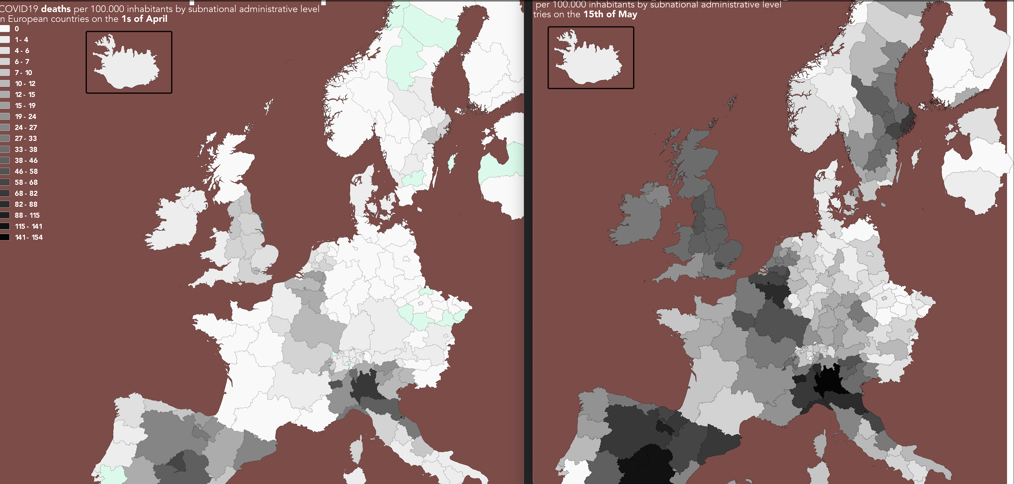
Mortality rates per 100,000 inhabitants on April 30 and May 15.
[twenty20 img1=”223585″ img2=”223586″ offset=”0.5″ before=”1 april” after=”15 mei”]
Mortality rates per 100,000 inhabitants on April 1 and May 15
[twenty20 img1=”223584″ img2=”223586″ offset=”0.5″ before=”1 april” after=”15 mei”]
Percentage of deaths in relation to the number of confirmed diagnoses on May 15

Tables showing the extremes
Regions with the highest and lowest figures for the European countries surveyed are shown in the tables below.
The highest number of diagnoses per 100,000 inhabitants on May 15
Lowest number of diagnoses per 100,000 inhabitants on May 15

Largest increase in confirmed diagnoses per capita between May 1 and 15.
Noteworthy this time is that the largest increase in the number of confirmed diagnoses can be seen in Sweden. Nine Swedish regions are followed by the Catalonian region (Spain). Sweden’s response to the corona crisis in recent weeks has been muted: no lockdown, neither have the schools or the hospitality sector been shut down.

Lowest rate of increase of confirmed diagnoses per capita between May 1 and 15.
Liechtenstein, Appenzell (Switzerland), and two Austrian regions stand out favorably among the regions with the lowest increases in diagnoses, closely followed by Southern Bohemia (Czech Republic) and Groningen (The Netherlands).

Highest number of deaths per 100,000 inhabitants.

Highest percentage of deaths relative to the total number of diagnoses (please note; this is not a case fatality rate owing to the lack of adequate testing and the delay factor).
Brussels (Belgium) and two British regions top the following list with the highest number of deaths relative to the number of diagnoses.

Lowest mortality rates relative to the total number of diagnoses (please note; this is not a case fatality rate owing to the lack of adequate testing and the delay factor).


