

The fact that the corona figures on this continent are heading in completely the wrong direction should come as no surprise to anyone. Not only in the Low Countries, but also in Central Europe, new records are being shattered almost on a daily basis, which does not cheer anyone up. The epicentre of this intense corona eruption this week is in former Austria-Hungary. However, the numbers are also extremely alarming in the Netherlands and Belgium.
Whereas last month countries such as Romania, Bulgaria and Latvia were hit hard, at the beginning of November, Slovenia, Austria, the Czech Republic and Slovakia are now suffering badly. In the Austrian federal state of Salzburg, no less than 1.7 percent (1,700/100,000 !!) of the total population tested positive for Covid-19 over a period of seven days. Such a high number has never occurred in the more than one and a half years of existence of these weekly corona maps.
For incidents above 1500 infections per 100,000 inhabitants in one week, a new shade of red has been added. These shaded areas were previously only used in very exceptional cases to denote outliers. Half of Europe has in the meantime turned into an ‘outlier’.

Record after record
With 18,437 new cases in Belgium and 23,591 in the Netherlands, another daily record was broken on Thursday. Daily records in themselves don’t say much, but things have been going badly all week. The situation is most dire in Dutch Limburg and West Flanders, but in fact, the spread is out of control almost everywhere at the moment.
The new legend that had been specially created for this new Corona in Europe series at the beginning of this month already seems to be in need of a replacement. This weekly map of the Low Countries consequently leaves little to the imagination.

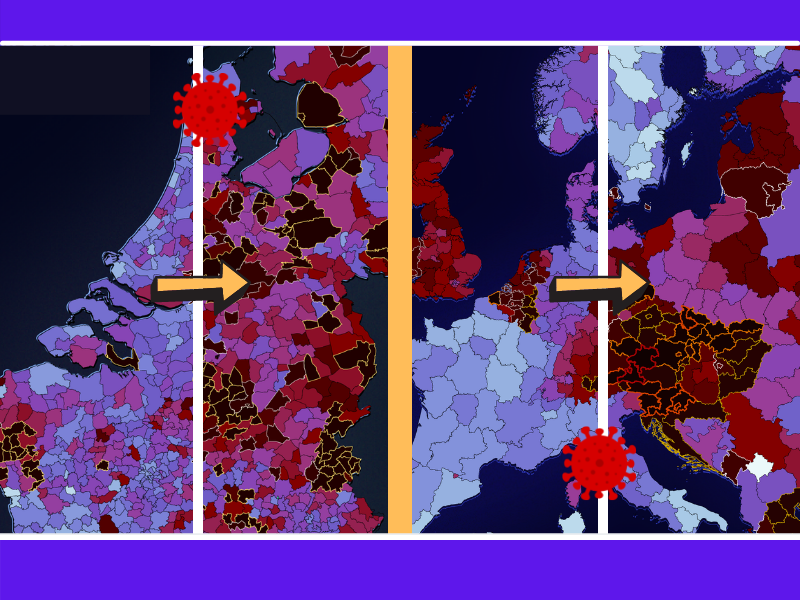
Slider maps and heat maps
Of course, these kinds of figures do not mean much without a frame of reference. For that reason, in the last series, comparisons were made with previous weeks with the help of slider maps and a heat map.
The slider maps of sub-national Europe and the Low Countries are back with the last week versus this week feature. Want to look back even further? You can do this with the heat map where the figures from the beginning of August are shown in colours so that it immediately becomes clear why they are actually called ‘corona waves’.
Test, test, test
If the number of new infections increases exponentially for long enough, the maximum testing capacity of a country will be eventually reached. This is already the case in the Netherlands. At the moment, it is virtually impossible for many Dutch GGD municipal health services to schedule an appointment for a test, which means that a lot of corona patients remain under the radar. Infection figures can therefore paint too rosy a picture of the real situation. Whether or not there is a record increase.
Which figures should we look out for in such cases? – The proportion of positive corona tests, which is hardly affected by a lack of testing capacity. This figure also indicates the extent to which the situation is under control. The WHO applies a standard of 5%. If a country is below this level, adequate source and track and tracing can keep a sharp eye on the spread.
A concrete example: Germany and Denmark are at more or less the same level in terms of infections per 100 000 inhabitants. Yet, outgoing Chancellor Angela Merkel speaks of a ‘dramatic corona week’, while the emergency in our northern neighbours is not (yet) too high. How is this possible? In Denmark, relatively more tests are carried out. A laboratory technician will find the coronavirus in only 1 in 100 nasal swabs, whereas in Germany the probability is ten times higher.
The Low Countries are also burdened by seriously alarming percentages. Even after a data correction that took into account the results of Testing for Access, the Netherlands is the worst in the class next to its immediate neighbours. The difference in testing policy becomes immediately clear after a glance at the sub-national test map below, which from now on will be updated every week.

Booster jab race
How will we manage to get through this wave? We won’t in the short term. The next few weeks will be a case of sink or swim. No single measure or emergency response is going to change that. Even where there is not much going on at the moment somewhere, the crisis could escalate badly within a very short time. E.g., in Bulgaria and Romania, the EU countries with the lowest vaccination coverage, there have been hundreds of victims a day for more than a month.
Since this autumn, booster vaccines have been administered in a lot of (wealthier) countries to vaccinated people who are in frail health in order to help them through the winter with the best possible protection. However, not every government has yet embarked on this massive booster vaccination drive. The continent leaders are – as they were in spring – Hungary and the United Kingdom.
As to how many third injections have been administered so far can be seen in this race animation. Because some countries are having trouble getting started or do not yet have a link to the Our World in Data dataset, it is possible that some countries are not represented. This will likely be rectified in the coming weeks.
Related Posts


