

To get right to the point. This is the final edition of IO’s weekly column Corona in Europe, a column the editor on duty has kept up since 2020 with a compilation of maps and visuals to make sense of the pandemic not only in words, but also in pictures. In this final edition, very little in the way of clarification and quite a lot of final chords in the form of covid maps.
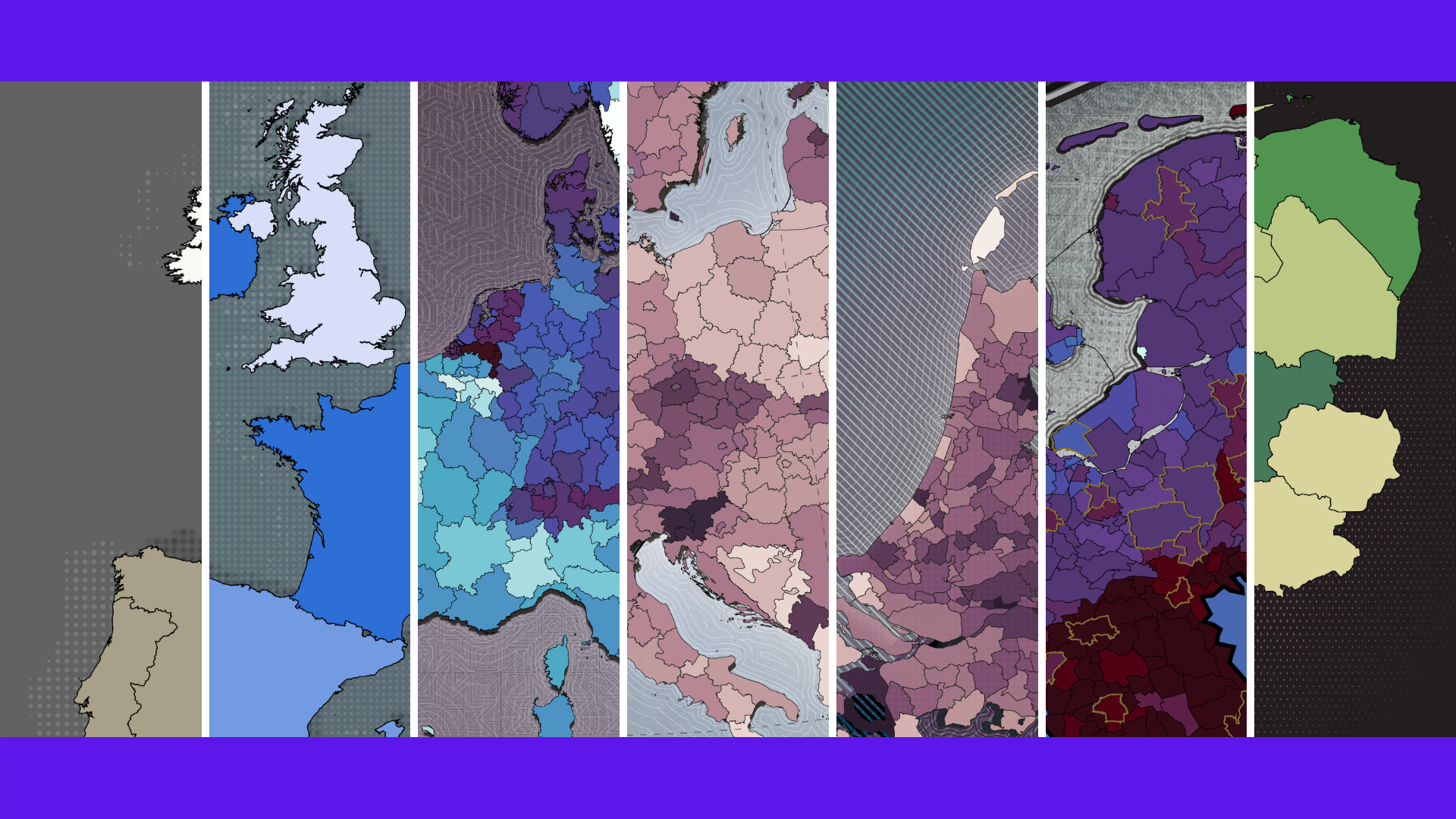
Especially for this very last issue, I made one more scintillating set to conclude this monster project in a grand way. A few ‘classics’ from this series are also featured. Nevertheless, this final round also starts with this week’s maps. Starting with the Benelux, where the past few days have seen some fairly bizarre differences between the various regions. That corona and carnival produce a rather fruitful union, is something that we have known since 2020. But this effect has never been so clearly mapped out until now.
On the map below where the figures of the past seven days have been placed next to those of two weeks ago, it is immediately apparent where the evenings were the longest last week. Brabant? No, in Limburg. But there was not much difference.
Corona polonaise
That the Omicron variant is highly contagious, as we have learned this year, especially with the help of the extensive Danish testing capacity. Over some weeks, as many as 1 in every 19 Danes tested positive for COVID-19. For such ‘Danish’ figures, no malfunctions, no Dancing with Janssen party or an overkill of test lanes is needed this time.

The carnival revellers in Eijsden-Margraten, Limburg, allowed the virus to circulate unchecked with the result that 1,875 residents of that village received an unpleasant phone call or text message during the ensuing seven days. Out of a population of just under 25,000, this amounts to 7 percent of the population in one week. The ranking below shows the other ‘carnival champions’ where more than 1 in 20 inhabitants contracted corona between March 3 and 9. In 2022, to be precise.

Déjà vu?
In contrast to two years ago, the situation surrounding corona is fortunately now quite different. Omicron is considerably less dangerous for each individual patient. We are quite familiar with the playbook of the pandemic. Although this variant was able to infect tens of millions of Europeans at the beginning of this year, no hospitals have caved in under the pressure. That was unthinkable until late last year with such sky-high numbers. Or in 2020…
Exactly two years around this time, after an awkward elbow greeting, we became acquainted with such concepts as ‘social distancing’, ‘the new normal‘, and the emergence of Dutch virologist Marion Koopmans. Carnival went down in history as the starting shot of the first corona wave. Personally, I had just started what I am about to end today: making corona maps. This is what the specimen of two years ago looked like with the first regional measures for the province of North Brabant following 387 diagnoses and four deaths.

Internationally on the map
Yet 2022 is a very different story from 2020. Thanks to a milder variant and a vaccinated population, the doors can now be opened once more. The Netherlands is anything but unique in this. The first two months of this year were marked by a relaxation of restrictions for almost the entire continent. Are infections going through the roof elsewhere too? Not so much, as a matter of fact.
That becomes immediately clear on the very last slider chart in this series. Can you spot regions on this specimen that are colored even darker than North Brabant and Limburg this week?
European carnaval champion
No less than 4.61 percent of all Limburgers tested positive for corona in the first days of March, closely followed by North Brabant. Only Iceland remains narrowly ahead of us. But that is a thinly populated island with fewer inhabitants than Utrecht and has very little to do with continental Europe.
Yet it is not only the Catholic sinners who can be found in the upper ranges. In a list of more than 500 regions, 9 Dutch provinces were in the top twenty of the most new cases of corona infections.
In complete contrast to the downward trend: on the very day that I am bidding farewell, the Netherlands manages to do something that has never been done before. We have been very close a number of times – partly due to computational mistakes – but never before has this side of the river delta been the fiercest corona hotspot on the entire continent.

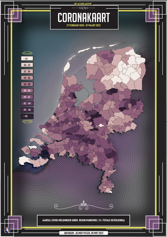
Cumulative retrospective
How bad is that? At any rate, not bad enough to keep going with this two-year long project that has got out of hand. To end things on a high note, I have made several new visualizations covering two years of the corona pandemic.
Such fleeting daily or weekly data, without context, will reveal not very much about the current situation. Do all the Dutch GGD municipal health services carry out the same level of testing? For an even more complete picture, the maps featuring hospitalizations and vaccination rates from the beginning of this year are also included; these figures have not changed very much since then.


Omicron
This set of end-of-year maps comprised three varieties – hospitalizations, vaccinations, and infections. However, Omikron’s advance caused this third one to lose its news value even faster than an average weekly map.
Although Omicron brought mainly good news for hospitals, never before have so many people been infected as in early 2022. We started the year with about 3 million unlucky people, but the counter has since almost hit 7 million. Pay particular attention to the percentages: December 30, 2021 and March 9, 2022 – a world of difference. And that’s not just because of the new hypnotic look.

Death and suffering
How many victims the corona crisis has claimed so far is quite difficult to attach a number to. Governments each have their own definition of what constitutes an ‘official corona case’. This makes it practically impossible to compare death rates between countries. For this reason, experts find excess mortality rates much more interesting for their assessments.
Listed below are the excess mortality figures in the Dutch safety regions and Belgian provinces visualized underneath one another for the calendar years 2020 and 2021. For the Belgians, the first wave was a much more severe ordeal than for the Netherlands, while here – partly due to the delay in boosters – considerably more people died last year than usual.
That every statistical excess death is automatically attributable to corona is obviously stretching it a bit too far. But the fact that many more pages of obituaries appeared in the newspapers for no apparent reason is a macabre indication. For the Low Countries, 2020 and 2021 are as different as night and day.
Vaccinated?
Although the Netherlands and Belgium differ considerably in terms of excess mortality rates, the worst suffering was spared in this part of Europe. Last year, The Economist magazine did an extensive study of the actual number of corona victims. This is what the picture looked like for Europe. Does vaccination coverage play a role here or is it merely a coincidence that most of the fatalities occurred among the biggest laggards of the vaccination campaign?


Done with corona
Why am I stopping? After two years of interpreting corona data from home and abroad, I am exhausted. Corona fatigue, like so many people. At some point, we all have to move on and just about every aspect of this subject has been covered or mapped out. It has to end sometime.
Why did I start this in the first place and didn’t just quit? Firstly, to inform people about the greatest crisis since World War II, which is something that makes a journalist’s heart beat faster. Secondly, I killed two birds with one stone because I could fulfill a long-cherished childhood dream. In a world paralyzed by a raging virus, I could give this very intense period a place amidst the dystopian events that followed one another at a murderous pace. This sinister chilly wind has thankfully begun to subside for now. Hopefully, it will stay that way.
Will corona fizzle out like a night-time candle, or will we be taking the same carnival reel off the same predestined shelf again next year? No idea. It could go either way. After all, it is a capricious virus, right? Still, one thing is beyond dispute. This whole monster project has more than achieved its goal. On February 27, 2020, I cobbled together the very first one. Two years and two weeks later, I finally put the finishing touches on the last one.


In case you have come to appreciate my work to such an extent that you think I deserve a tip, then go to BackMe.org or BuyMeACoffee to drop a donation. That would be really sweet! Not planning to? No hard feelings! Then let’s wrap things up with a corona cartography retrospective!


Related Posts
 winners of the Gerard and Anton Awards")


