

In order to end the New Year in a festive way and kick off 2022 in a fun way, maps outweigh words in this edition. New Year’s Day is not really the day that many people want to read a lot of text. We’d prefer to look at pictures and maps instead. That should work, right? Good. Because this period is about looking forward, but also about looking back.
As 2021 moves into the history books, we take a moment to look back. The second year again that was entirely dedicated to corona. This time last year, Alpha also surfaced for the first time. After ‘Dancing with Janssen’, this mutant was replaced in no time by Delta, which had to acknowledge Omicron’s superiority within just a matter of weeks. It was announced this week that this new ‘milder’ variant has now become dominant in the Netherlands.
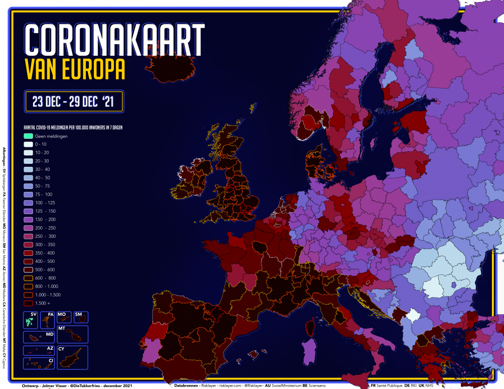
What will this mean for the corona figures? They are bound to rise, everywhere. Exactly how bad is that? Not so bad, if you have enough hospital beds available. Spain, France, Ireland, Italy, Portugal, Denmark, Greece and Britain are at most a few weeks ahead of the rest of the continent. Delta is still making inroads! Central Europe is still seeing the last vestige of the colossal flames from early last month that sent Slovakia and Austria into lockdown.
Boosters versus virus tidal wave
It seemed to be pretty all fairly under tabs in most countries even as recently as this past month. With a few exceptions, at the beginning of the month there was a sort of equilibrium whereby measures and vaccines were able to keep the spread of the virus more or less under control. That is now completely different, as are the countries that are taking the brunt of it.

On the slider chart, this week’s figures have been juxtaposed with the situation at the start of December. And the colors on the heat map also go in only one direction in the countries where the Omicron takeover took place. In just seven days, France and the UK reported 850,000 and 978,000 new cases respectively. This particular virus must be exceptionally mild if it is not to have any dire consequences….
Is the Netherlands catching up?
A booster shot then? In the final week of the year, after a lot of poldering, preparation and optimization, the Netherlands seems to have patched up the gap. Although there is still a significant backlog to be cleared, within seven days, the gap between the Netherlands and six other EU member states has been closed.
These are not really the absolute high-flyers, of course, but at least the editor-on-duty was really cheered by the climactic animation of the European Championship Booster Shots.
Not so bad here (yet)
In the Low Countries, no daily records have yet been broken as a result of the Omicron surge. Yet this does not mean that it is not spreading throughout the Netherlands and Belgium. Still, nationwide, the numbers don’t really seem to be escalating that much yet. Which in the Netherlands is definitely also partly due to the restrictions that have been in place for 14 days now. However, the drop amongst our southern neighbors is much steeper. And they have not even needed a lockdown to achieve this.
The colors on the slider chart have even dropped in recent weeks towards values that are good in most municipalities for either purple or blue tones. The fact that this is partly caused by the supple legend that the map maker on duty was forced to introduce should not immediately quash this sliver of optimism.
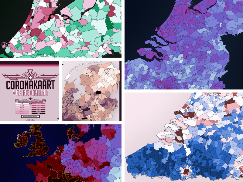
Where is Omicron?
It is easy to see from the European maps of the past few weeks in what kind of places Omicron is spreading rapidly. It is precisely the same story as it was with Alpha and Delta. Capital cities with a lot of visitors from across the border are usually affected very quickly, hotspots in tourist areas during the high season are the rule rather than the exception, and now the same seems to be happening all over again. Not only in Copenhagen, Paris and London, but also very much in Amsterdam and Brussels.
With the Last Week versus This Week maps it was pretty simple to spot. This edition unfortunately features not a European, but rather a municipal map with the ‘predictive gift’. Increases are clearly evident in the Amsterdam area, but around Brussels there are even more viral flare-ups going on. Tens of thousands of new infections every day seems to be just a matter of time…

Two years of pandemic….
Covid-19 got its name because Chinese researchers reported the SARS-nCoV2 virus as a potential threat to the WHO on December 31, 2019. Although we would only fully realize the bitter consequences a few months later, the years 2020 and 2021 have become more or less carbon copies of each other. Regrettably. Just because developments are moving so fast and cumulative figures are not changing that much after all this time, that does not mean that these cannot offer us an interesting glimpse into our rear-view mirror.
So, in order to “celebrate” two years of Corona in Europe, I am going back to where it all began. The very first municipal map of the Netherlands was made by the editor-on-duty on 27 February 2020. This is what it looked like back then. On December 30, 2021, we tended to express such figures in terms of infections per 100,000 inhabitants. Nevertheless, even this is no longer necessary after all this time as far as cumulative figures are concerned.
In some municipalities, the Dutch Municipal Health Service (GGD) has already had to give more than a quarter of the population bad news about the results of their corona test.


Vaccinations and hospital admissions
Unfortunately, the vaccines that had been developed in record time failed to give us relief from corona that many had hoped for last summer. With the arrival of Omicron, it remains to be seen how long the boosters will be effective. Still, this by no means implies that the inoculations were useless. In fact, the cumulative numbers of hospitalizations per capita are significantly lower in municipalities with high vaccination coverage, as can be seen on this week’s updated closing maps.

Coincidence does not exist
Why do relatively high numbers of corona patients come from communities with low vaccination coverage such as Nunspeet, Urk or Reimerswaal?
All the same, it is a tad simplistic to immediately accuse religious communities of debauched behavior. The real Achilles’ heel which is causing the Dutch numbers to lag behind those in Flanders can be easily spotted in Brussels. Many “vaccine refusers” turn out not to be wackos or devout believers at all in practice. There are thousands of unvaccinated people living in underprivileged neighbourhoods who do not speak the language and are not even aware that it is at all possible.
Reaching these people is quite a challenge. Take infectious disease specialist Jaap van Dissel’s story at the last Dutch press conference. If the average Dutch citizen already does not understand a word of his rambling, how should a Syrian newcomer from the Schilderswijk manage to do that? It is no longer really news, but thanks to the vaccines, a whole lot of suffering iamongst the public and even more misery has been prevented thanks to the lockdowns. They do not work perfectly. No measure against a pandemic ever does.
Has the excess mortality rate and inadequate testing capacity even been resolved? Hopefully these items will be on the lists of good intentions of the new government team.
Wishing you all the best! May 2022 be as full of hope, just as we hoped 2021 would be.

Previous editions of Corona in Europe can be read here.
Related Posts


