

9,058 new corona diagnoses in Croatia, 17,047 in Finland, 23,817 in Ireland, 26,200 in Denmark, 27,796 in Belgium, 39,570 in Portugal, 50,126 in Greece, over 218,000 in the United Kingdom. A thousand more in Italy and a whopping 332,252 tested positive in France. Weekly figures? No. These are daily stats. The Omicron variant is on the loose in Europe, and wildly so.
Nothing seems to faze this new dominant coronavirus variant. Whereas the original variants, Alpha and Delta, could still be curbed by vaccinations, lockdowns or testing capacity, in the first week of the new year it seems as if a completely new pandemic has emerged. A new pandemic with new ground rules that no one really knows yet.
So to cut a long story short: never before have so many people contracted Covid-19 as they are now. Not caught it yet? That’s just a matter of time. We’re all going to get it. If this “milder” virus continues to spread at such a lightning pace, it’s just possible that we’re on the eve of the endemic phase of the corona crisis.
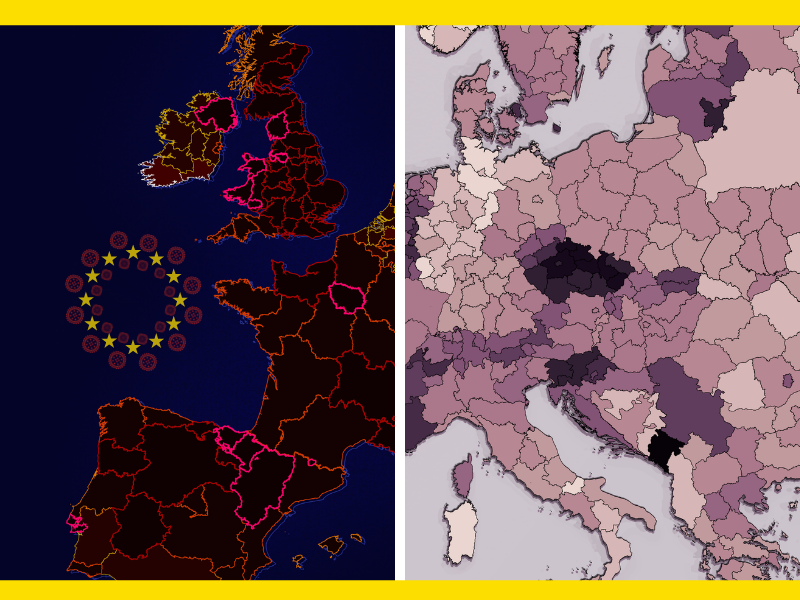
Back to the here and now. One thing is certain: Omicron is highly contagious. So contagious that the weekly corona map of Europe has become practically unusable.

New ground rules, new visuals
Not only does the former legend of the European map seems to be exhausted, but also the heat map with the weekly medium-term figures hardly offers a frame of reference anymore. To properly visualize this latest ‘curve’ that we need to flatten, the figures from the past six weeks from 14 countries have been taken. Pay particular attention to the order and how this ‘ranking’ has now been almost completely reversed.
Unstoppable
Everywhere that Omicron becomes dominant, the numbers go through the roof. In early December, this began in the United Kingdom and Denmark. This was followed by Southern Europe. Sweden, Finland, the Netherlands, Belgium and Croatia appear to be the next countries where daily records continue to pulverise each other. Only the Germans and Norwegians seem to have their infection rates somewhat under control. Central Europe, which was just the scene of a colossal Delta wave in November, looks as if it will be spared that new Greek letter for a while yet.
The weekly charts from mid-November, December and now, differ like night and day. The sliders below show how Delta made life miserable for Austrians and Czechs last fall, and how Southern Europe is evidently coping better with the preceding variant, which has since become an endangered virus species in many countries.
High tides for low lands
The Netherlands and Belgium also appeared to have been spared the worst of the Omicron misery in the first week of 2022. But here too, the tide is already turning in the numbers. Even the near-lockdown of the Netherlands – where schools have reopened – could not prevent a daily record number of positive tests being reported by the National Institute for Public Health and the Environment (RIVM). In Belgium, eyes are mainly on Brussels and the Omicron oil spill that is steadily spreading from there across the rest of the country. On the slider chart below, you can see a comparison with the final week of 2021.
Better late than never
Is nothing going right at all, then? Definitely! The Netherlands is now Europe’s fastest booster jabber and, as of this week, registers in the continental mid-range. It took almost four months, the excess mortality rate rose to the highest in Western Europe, but now the booster campaign seems to be off and running. The catch-up is very clearly seen at the end of the race for boosters. Still, it is not yet enough for the European leaders, as other countries are also scaling up and have been doing booster shots since October.
Almost two years…
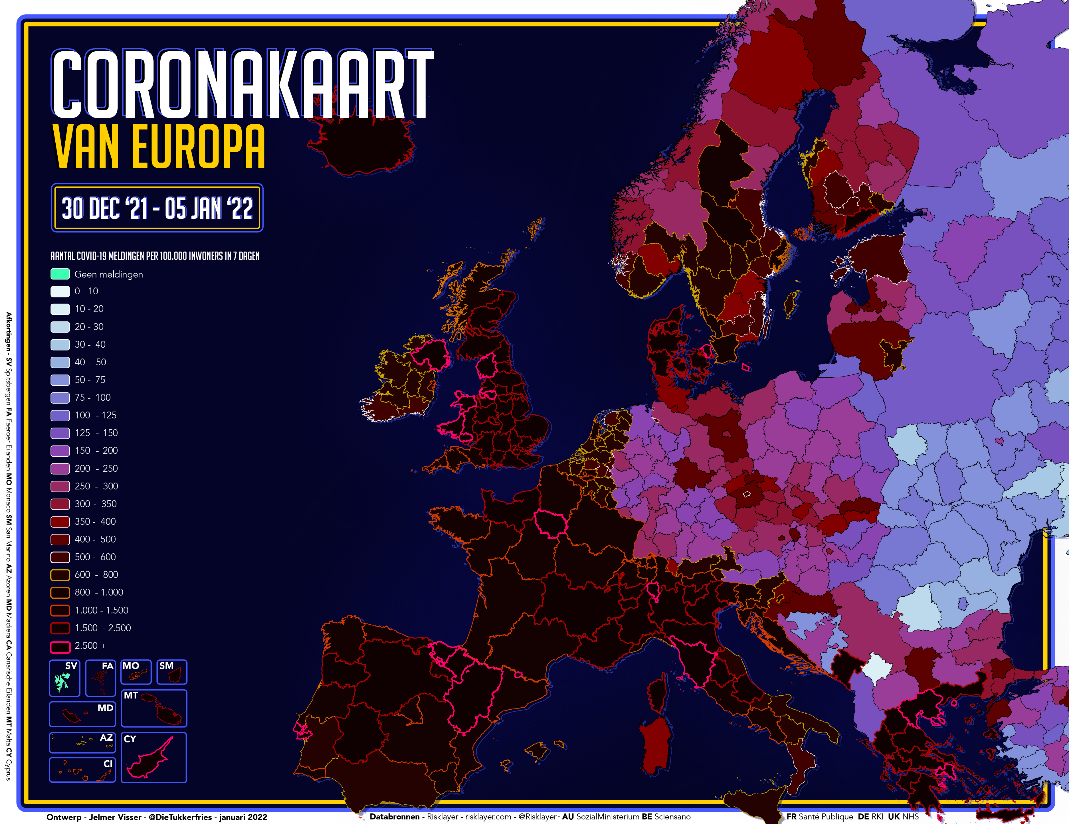
While it all looks very colorful and quite acute on the weekly maps, for an individual person, a pandemic is mostly pretty boring in practice. Still, we have been in this prolonged pandemic marathon for almost two years now, which will hopefully end with Omicron. Weekly maps tell the story of one week in time. This new series of cumulative corona charts looks back even further. Since the very beginning. This week’s final map shows the number of corona reports since the beginning of the crisis on a subnational level.
In the Pohjois-Karjala region of Finland, only 1.7 percent of the population tested positive for corona throughout the pandemic. Nowhere in Europe was the probability of contracting a corona infection so low in the past two years as there. Montenegro has the highest cumulative incidence rate on the continent with 28.5 corona cases per 100 inhabitants. The Czech Republic, northern England and Slovenia are also far above the average.

The Low Lands
The three cumulative maps showing the Low Lands from last week’s edition can be seen here again. The advantage to this new variant is that after almost 24 months of the pandemic, the data is not likely to change that quickly. Unless, of course, Omicron has some weird plans….


You can read previous editions of Corona in Europe here
Related Posts


