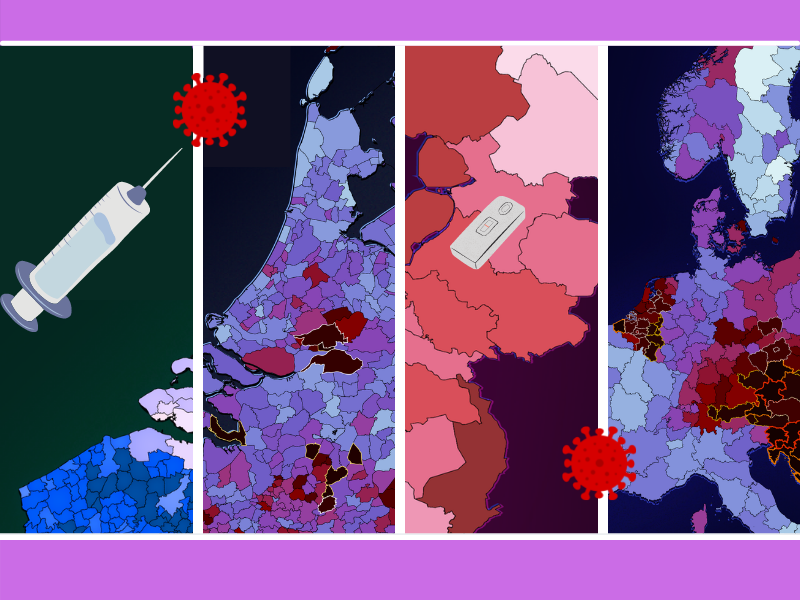
A few months ago, it seemed like such a wonderful prospect – a carefree summer vacation with the pandemic behind us and two vaccination shots in our upper arms. Unfortunately, 2021 has not become the year ‘in which everything turned out all right again’, but a pandemic repeat performance. As it seems we are back to square one, the column ‘Corona in Europe’ is making a comeback on Innovation Origins in a new format.
Because this pandemic transcends national borders, it can be very enlightening to zoom out a bit further. Each week, a new series of corona maps and infographics through an international lens takes center stage in an effort to provide a visual interpretation of the corona pandemic based on data. Don’t worry: this is not as boring as it sounds. The visualizations are designed to guide laypeople through the complexities of pandemic issues.
To help with this, the Corona map series has been given a makeover with clear colors for the various metrics and more consideration has been given to composition. How are we faring right now? Badly. Although the legend from the previous compilation has not changed, the colors speak for themselves. The lion’s share of the data comes from Risklayer, a team of fanatical German data collectors with a stellar track record.
Infection records and measures
Only a handful of countries have not choked on the skyrocketing infection rates over the past week, which have also already led to overcrowded hospitals and excess mortality rates. Especially in countries with low vaccination coverage, such as Bulgaria, Russia and Romania, the suffering is severe. In recent days, the highest prevalence rates have been spotted in Slovenia, Croatia and Austria (the latter is testing fanatically). In the Netherlands, a daily record was broken in Sint-Maarten, but even this is hardly out of step on a continental scale.
It’s almost a case of sink or swim. Even with Thursday’s staggering 16,287 new cases, the Netherlands ranks 13th in Europe’s dubious prevalence rankings. Prevalence rates say more about the current situation in a country because it is calculated on the seven-day rolling rate per 100,000 inhabitants. Daily rates can be very erratic and vary greatly between weekdays and weekends. This is what this looks like on the municipality level for the Netherlands and Belgium, which will take on a more prominent role in this new Corona in Europe season.
Please note that the legend on these maps has been adjusted upwards to avoid a complete black/red picture and to be able to keep spotting the various differences.
Low countries, high numbers
Both countries form the backdrop of the most intense viral hotspots since the beginning of the pandemic. In the Netherlands, a very distinct Bible Belt is discernible and in Belgium there are severe clusters in West Flanders and Liége. Almost everywhere, the numbers are shooting through the roof and concerns are mounting at a rapid pace. Yet two municipalities have managed to keep rates at ‘zero’ during this entire week of disaster: the Wadden island of Schiermonnikoog and the Flemish Limburg town of Herstappe, where none of the 78 inhabitants have received news of a positive test result.
Testing, testing, testing: that has been the message ever since the first wave. Testing is now being done en masse, but given the proportion of positive results in the first full week of November, neither the Netherlands nor Belgium is managing to get a grip on the pandemic with this defence mechanism. If infections keep on increasing at such a frenetic pace, the proportion of positive coronal tests may be a more reliable indicator of the epidemiological status.
Few tests also means few infections. Yet this does not actually in itself prevent a high proportion of positive tests. The WHO states that the situation is under control when there is a rate of 5% or less of positive tests. The Belgians, with a national average of 11.2 %, are well above this. In the Netherlands, with 17.2 % – and even nearly 23 % in the South Holland Safety Region – the situation is considerably worse.
Jab for life?
Everyone who wants to has been able to get their corona vaccines during the past few months. At a European level, the low countries are slightly above average, but the differences in vaccination coverage between regions are substantial. The highest percentages occur in Flanders and the eastern part of the Netherlands is also significantly higher than the rest of the country.
Municipalities with a large Dutch Reformed community and deprived urban areas have the highest number of unvaccinated people. In terms of absolute numbers, the situation in Brussels and Rotterdam is of particular concern. The final map of this weekend edition shows the percentage of fully vaccinated adults.
Whereas in the Netherlands some overlap with the infection map can be seen, West Flanders unfortunately proves that even averages of well over 90% cannot prevent fierce outbreaks of the highly contagious Delta variant. Time for a booster? It would appear so.

