You may have noticed, but corona is on its way out. Not only in the Netherlands, but in (almost) all of Europe. The acute threat of this pandemic does not seem to be an issue for the time being. The good news? Not that much pandemic misery abounds. The bad news? Not a lot of dots to connect up a lengthy Corona in Europe intstalment.
Should nothing shocking happen, this month marks the end of this column in its current form as there is little to report. This June month will get two more regular editions and two short updates with visualizations of the figures. And this week’s offering is short and sweet.
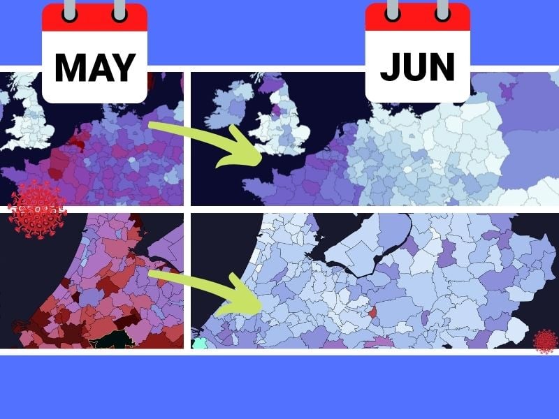
Here are the fresh visualizations from Europe: Significant declines everywhere, except for a few areas in England and Scotland. This is attributable to the spread of the more contagious Indian variant. We’ll be monitoring that over the coming weeks.
For the first time in 2021, the red areas on the sub-national map of Europe with data up to and including Thursday, June 3, are completely gone. The sliders show a comparison with what happened two, five and nine weeks ago.
The week in sliders
Most new diagnoses per 100k

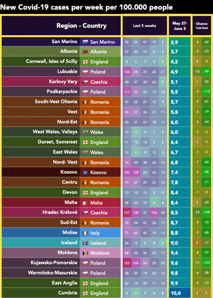
Least new diagnoses per 100k

Half a year on the heatmap
The Netherlands is almost blue!
The Netherlands would still appear to be among the leaders in Europe when it comes to new infections. But while the decline is slowest here, it’s all dropping at a pretty rapid pace here too. Even the first mainland municipalities with zero infections in a whole week are gradually becoming more common.
Here are the maps of the Netherlands comparing the past week with 14 days ago and a month back in time.
Blip or jab?
Clearly, the dark pandemic clouds are not to be seen in Europe or the Netherlands at least for now. Last week’s very localized outbreak in Staphorst is fairly out of the ordinary. Whether this typical peak is a statistical blip or the result of vaccine refusers cannot be ascertained from this data.

