

For those of you who have been living under a rock, the corona figures have not been doing very well lately. This is not only the case in the Low Countries, but it seems as if the whole of Europe is about to go under in this unprecedentedly heavy late-season wave of infections. One country after another is seeing the numbers soar.
Panic has struck politics. On Monday, Austria announced a national lockdown. Since Wednesday, Slovakia has also gone into lockdown. And in all likelihood, it won’t just stop with these two. The figures had already painted an inky-black picture for Central Europe. Now Western Europe also seems to be overwhelmed by unmanageable numbers of corona patients that not even Germany’s solid healthcare capacity is able to cope with.
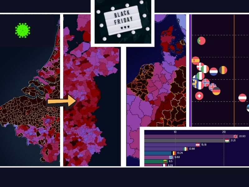
The sub-national corona map of Europe shows that this week is Black Friday – and not just for bargain hunters.

Viral inferno
How did last week compare with the previous weeks? Very poorly. Never before in the one-and-a-half year existence of this column have such high infection rates ever occurred. This becomes immediately apparent with the heat map that includes the weekly data from August onward on a national level, and the sliding map where the week of November 18 to 24 is laid next to that of two weeks ago.

Covid tsunami engulfs the Low Countries
In the Netherlands and Belgium, the situation is more or less the same. With comparable vaccination rates and record increases, a tightening of measures is just a matter of time. For the time being, the Dutch government has no intention of following the example of the Austrians and Slovaks by going into complete lockdown.
At the beginning of this month, the weekly map of the Benelux countries (excluding Luxembourg) received a new legend which took these increases into account. Nevertheless, within three weeks it had to be replaced again. Why? When entire provinces consist of municipalities shaded in black with yellow patches, then maintaining such a map with data is rather pointless. This week’s sliding map clearly shows that the current legend has had its day.
Per 100,000 or per 100?
Since it is expected that the numbers will continue to reach record highs for some time, the entire layout has been modified. The legend has been given an exponential scale with higher threshold values. And since 1,000 new reports per 100,000 residents correspond exactly to 1 percent of the population, the number of infections is now expressed in percentages.
In some places in West Flanders, more than 1 in 50 residents – that is, 2 percent – tested positive for Covid-19 in just seven days. That said, the colors on this updated version continue to paint a bleak picture of the future.

Procrastinating with boosters
The Netherlands is still in no hurry to triple vaccinate the most vulnerable and oldest target groups. A third shot like this could prevent a great deal of suffering. In the case of the British, where infection rates have been high for some time, the pressure on hospitals does not seem to be as high as it is in continental Europe.
Will the boosters ensure the Brits a December without any lockdowns? Time will tell. But not every country is in such a hurry. How swiftly the booster campaign moves from country to country is visualized in this latest race between countries, with a painfully embarrassing role as a prime laggard taken on by the Netherlands.
More vaccines, fewer deaths
As if this were not enough, another dark cloud coming from South Africa may be lurking on the horizon. Because a new vicious virus variant – which is purportedly even more contagious than Delta – has surfaced. B1.1.529 is spreading among young South Africans and has already been found in Hong Kong and Botswana. It is too early to say whether it is eligible for a Greek letter, or which one. Let’s hope it doesn’t see any benefit in going on a European tour.
Wasn’t the vaccination campaign earlier this year supposed to prevent the dire situation that exists today? On paper, yes. In fact, if the Delta variant had not thrown a spanner in the works, the resurrection of this column would most likely not have happened. However, this highly contagious mutant virus is proving to be a very tough adversary that we will not be rid of for some time yet.
Are the shots not working then? They definitely are. But while they can’t prevent crowded ICUs, it surely not a coincidence that the countries with the highest vaccination rates on 1 November report significantly lower mortality rates three weeks later. This week’s concluding chart shows the proportion of vaccinated people in each country versus the mortality rates. An optimistic final message? The disaster would only have been truly complete if Delta had been free to blaze a trail of destruction across a completely unvaccinated population a year ago.
Wishing you a happy Black Friday.

Related Posts


