

The Coronavirus – still something that was far from our daily lives a month and a half ago, is now furiously sweeping through The Netherlands. But not as drastically to the same extent all over the country. That one region is being hit harder than another has been clear from the start. The first outbreak was in North Brabant and Limburg, but now the virus is practically everywhere.
Just over a month ago, Dutch Prime Minister Mark Rutte announced the very first measure: stop shaking hands. Over the following weeks, measures were stepped up each time: one and a half meters, social distancing, bans on gatherings, fines and the closure of public places.
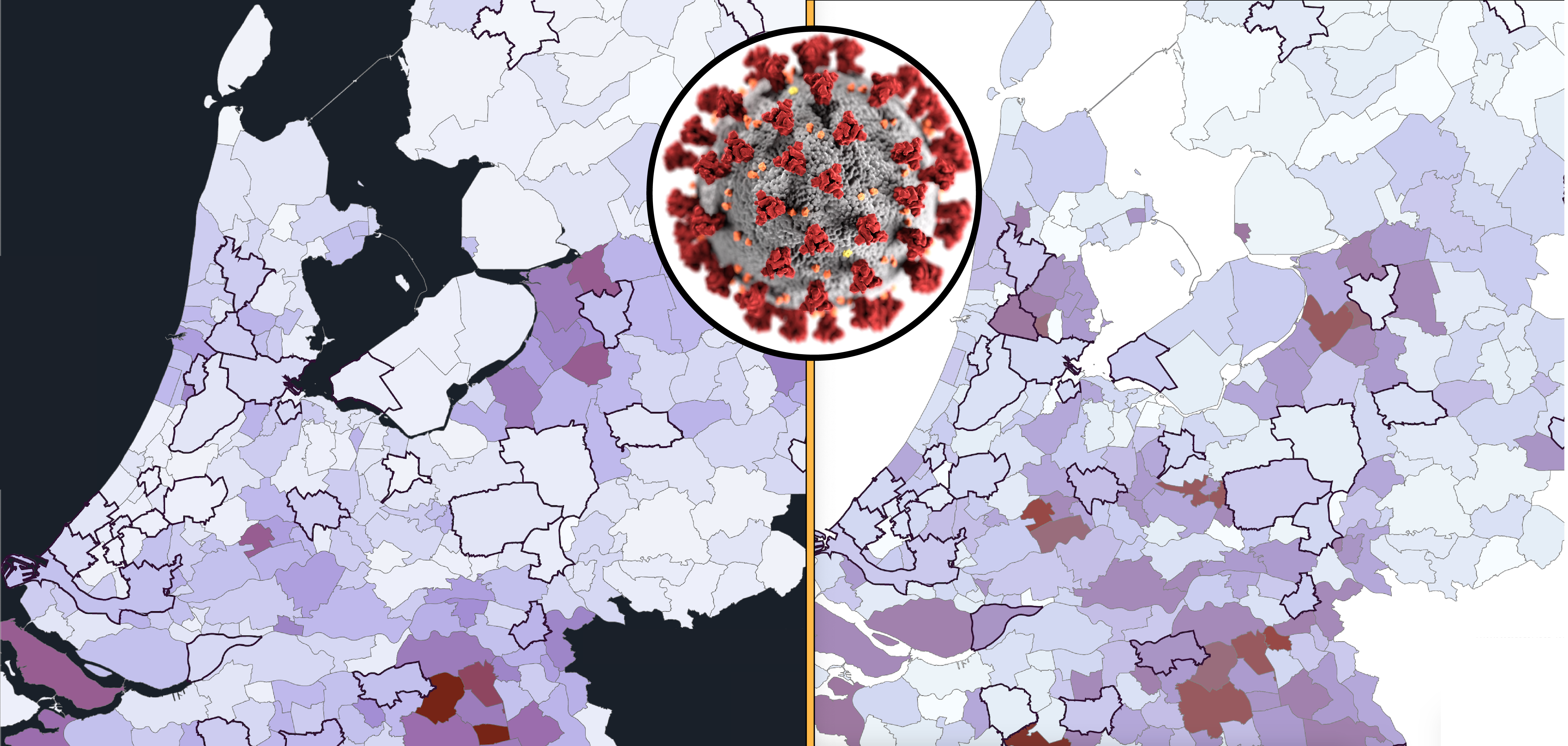
The first series of measures came into force on the 15th of March. Since COVID-19 has an incubation period of five to fourteen days, the preliminary effects of this ‘smart lockdown’ only became noticeable from the 20th onwards. And we had to wait until the end of March for the full effect of the initial measures.
Is it working? In a nutshell, yes. The figures are still rising, but the exponential element has subsided. That’s good news! This effect is also visible in the data, but the regional differences are substantial. Where are things going ‘well’ and where are relatively large numbers of new patients being registered? You can see this on the chart below.

Brabant flames are being extinguished while Amstelland is lighting up
This chart shows the progression of the number of confirmed diagnoses between 20th of March and the 10th of April. Although it doesn’t reflect the transmissions that took place before then. Tilburg and Breda, which topped the worst lists in the early days, hardly stand out anymore. In the meantime, the Zwolle region seems to have been transformed into an oil slick that stretches from Hardenberg to Harderwijk. Limburg is also far from being rid of this scourge.
Dark clouds also seem to be looming over North Holland. Especially to the north and west of Amsterdam. This is not (yet) seen in numbers per 100,000 inhabitants in the capital as a consequence of the high population density. Yet it becomes clear when you look at the colors of Alkmaar, Zaandam, Haarlem, and Amstelveen.
Three weeks is still quite long. Let’s zoom in on the last week for a more recent rundown of the spread. Note, however, that this can only be done with the hospital admissions figures, because the RIVM (the Dutch National Institute for Public Health and the Environment) did not release diagnostic figures at a municipal level between 30th of March and the 8th of April. If you take a closer look at the increase between the 2nd and the 8th of April, the Zaanstreek area has now turned a few shades darker.

The closer you get to Dordecht …
The same effect, albeit more subtle, is seen to the south of Rotterdam. The city has more or less typical averages, except a shift is apparent in the Hoeksche Waard, Vlaardingen and Dordrecht areas. Rotterdam was not exactly a hotspot at first, but on Saturday, April the 11th the number of diagnosed infections rose to 1120. This makes the city, together with Amsterdam, the unwelcome frontrunner of The Netherlands in terms of absolute numbers of diagnosed infections. Although the surge around Rotterdam is happening much faster. Since the 30th of March, 549 people here have tested positive for NCoV-SARS2, as in COVID-19.
 Moreover, the Zwolle oil slick seems to be spreading to the northeast towards the city of Drenthe. The capital of Overijssel is by far the largest city in the surrounding area and therefore has a role as a hub. Are some commutes still being made despite the fact that many people are now working from home? Is that due to the ‘Bible Belt Effect’? (As in, insular communities that tend to quickly spread disease, etc, ed.) Further research should reveal this. It is already recognized that many bible belt communities such as Goeree Overflakkee, Urk and Nunspeet are experiencing significant increases. Bunschoten, Veenendaal, and Barneveld – who are also famed for their bibles and black stockings – on the other hand, are not following this trend at all.
Whatever the cause, the differences between them are noticeable. The damage in the Haaglanden region, for example, has so far been relatively limited. While one region appears to be almost immune to the coronavirus: the Achterhoek. Which is quite amazing considering the carnival festivities and the by now notorious early spring break. Is this the Ferrera Erbognone of The Netherlands where, for some unknown reason, the residents are more resistant to the disease? Or perhaps they just aren’t partial to visitors? According to the Achterhoek GGD (the Dutch Public Health Service) doctor Ashis Brahma, this is due to their law-abiding natures and neighborly attitudes. However, the latter is also true of Twente, where spread rates are measured that are in line with overall national trends.

Today’s records = last week’s diagnoses?
Diagnoses, hospitalizations, mortality rates, it’s quite a mishmash of figures, none of which really tells the whole truth. After all, most of the corona iceberg is still underwater, so it’s full extent is open to conjecture. A common criticism of the diagnostic figures is that they are inaccurate because of the lack of testing.
Hospital admissions are more complete, but incomplete at the same time and inherently more dated than diagnoses. Someone who has been diagnosed with corona is usually not admitted straightaway. Certainly not if there is an adequate testing policy in place. A patient first has to become ‘ill’ enough to end up in the hospital. And this takes an average of around 7 to 8 days, according to Chinese statistics from Wuhan. So is the blue diagnosis chart really one week ahead of the red admission chart? Ideally, yes; but at the moment in The Netherlands, ever so slightly.
Nonetheless, even here more factors and nuances should be taken into account. For example, there are municipalities with lots of admissions yet just a few diagnoses. This incongruity is quite evident in larger municipalities. In Venlo, Zaanstad, and Almere, for example, relatively high rates of COVID-19 patients end up in hospitals compared to other cities. Do they live unhealthier lives? Most likely. But these are not student cities either, so it is quite plausible that more elderly people live there. On the April 11 diagnosis chart here below, there doesn’t seem to be much going on in these places. Why is that?

From blue to red
Places like Maastricht, Nijmegen and Rotterdam ‘score’ higher on the diagnosis chart. This effect is most pronounced in Groningen; even though it’s not shown on that chart, only 15 of the 129 registered COVID-19 patients have been admitted to the hospital. This amounts to just 11.6%. Whereas in Venlo and Almere, this percentage is 61.3% and 60% respectively.
This may seem strange, but it has a simple explanation: in the ‘bluer’ cities there are large hospitals and more tests are routinely carried out among healthcare staff. When combined with a younger population due to the number of students, a COVID-19 diagnosis is more likely to involve an elderly person who has serious underlying health conditions. Could this also explain the peak in the ‘grey’ Bible Belt area?
Rotterdam rates have risen rapidly in recent days. Both the weekly chart at the beginning and the diagnosis chart clearly show this. But the admission chart doesn’t (yet). Could this be down to the Erasmus Medical Center? It is possible. But does this also explain the surge in the surrounding municipalities? Moreover, a large hospital does not rule out the possibility that transmissions might not occur elsewhere in that city.
Crystal ball or grasping at straws?
Can we expect an influx of patients next week from the Rijnmond region or from municipalities such as Tubbergen, Vijfheerenlanden, and Gorinchem? Chances are high. Predictive capabilities are dependent on testing. A vast amount of tests.
If this is done properly with tens of thousands of tests per day as planned, the blue chart – bearing in mind prior demographic knowledge and statistical blips – should be roughly one week ahead of the red chart. Unfortunately, with regard to the charts of April the 12th, this can only be tested in one more week’s time because of the gap in the RIVM’s diagnostic data.
Can we use information from the past to interpret the present and predict the future? Sure, but if this is also the data we should be considering … Who knows? The diagnosis chart from March 30th along with my original purple color gradient and the admission chart from April 6th do turn out to show quite a few similarities.
Curious about your municipality? My entire resource database is featured on Google Sheets.

Related Posts


