

The summer holidays have officially begun. Something we have all been looking forward to after a turbulent six months. Nevertheless, the coronavirus has by no means taken a vacation.
This is evident from recent developments in several countries: new lockdowns in Portugal and Spain, an emergency meeting after alarming increases in corona patients in Belgium, and the discovery of hundreds of new clusters in France, some of which are in holiday areas.
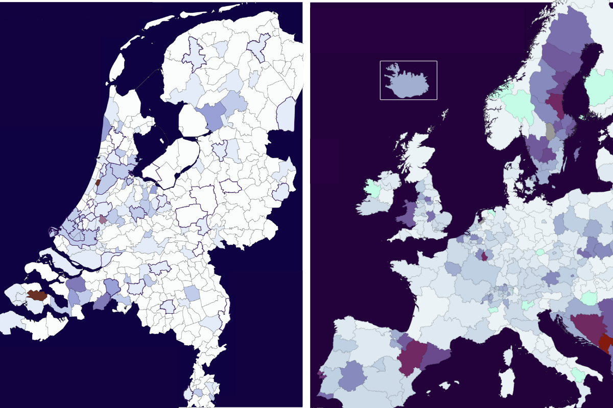
But surely the coronavirus is giving the Netherlands a break, right? Well, no. The trend of the past few weeks of European-wide increases has not skipped our country at all and, moreover, is far from being on the way out.
Meanwhile, there are indications in several countries that a second wave has started. This is how this new surge in COVID-19 cases looked on the European sub-national map. We compare July 17 with July 10 here:

Dark corona clouds are rolling in
While the colored patches on the map have been quite light across most of continental Europe over the past few months, some purple peaks have been seen. Spain’s cause for concern becomes clear at a glance. The Balkan countries, too, have had to deal with a fairly substantial increase in new patients since June. While Sweden has been a train disaster since the end of March.
Luxembourg, which has suddenly had to contend with more corona cases since the end of last month, also seems to be infecting neighboring regions. In Belgium, both Antwerp and West Flanders stand out. And also in Portugal, Poland, the Czech Republic, France, Great Britain, Switzerland, and Denmark, more Covid-19 cases were detected last week than between July 3 and 10. Although no increases can be seen as yet in Italy, Ireland, Norway, Finland, Greece, Hungary, Slovakia, and the Baltic States.
Yet in the Netherlands, the province of Zeeland is significantly darker than the rest. This can mainly be traced back to the town of Goes, where two house parties led to dozens of new diagnoses after the young attendees turned out to have infected their older family members. Flevoland is grey due to data corrections on this map and Groningen had a diagnosis-free week.
Of course, a map like this in itself still doesn’t tell you very much. So, below is the same map using the same measurement scale for the week from June 5 to June 12 when relatively little was going wrong in Western Europe, given that most countries were fresh out of a lockdown situation. Below that is the European map from last week. The most recent one contains some new purple spots.


The Netherlands as a trend follower?
Is this rise, which is already being responded to in Belgium, France, and Spain, also visible in the Netherlands? In short: yes. And it is also quite obvious.
In order to gain insight into this, we work with municipal maps that show the increase in the number of diagnoses per 100,000 inhabitants over four days.
This resulted in a set of four corona maps with designated time frames: July 4 to 7, July 8 to 11, July 12 to 15, and July 16 to 19 wherein a clear upward tick is clearly noticeable.
For each time frame, the rate of increase continues to rise, and gradually more and more dark patches are emerging. The number of municipalities with an increase of more than 7.5 patients per 100,000 inhabitants rose from 9 to 23 within four weeks.


The last map of this series, which covers July 16-19, reveals a totally different situation than the one at the beginning of this month. That drop in corona infections appears to have waned already. Corona patient numbers are also on the rise again in the Netherlands. As this increase is rather recent, this is not yet reflected in the rate of hospital admissions or deaths. As a rule, these increases follow 2 to 3 weeks after an increase in new cases.
The increase is most pronounced in the provinces of South Holland and Zeeland, but actually all over the country there seem to be signs that a second wave may be imminent. Between July 4 and 7, the total number of corona cases in the Netherlands rose by 0.29 percent. On the most recent map, this rose up to 0.72%. Moreover, on the two maps in the middle, it looks as if an upward trajectory has been started. And since there has been a stable number of tests for several weeks in a row, this increase cannot be attributed to an increase in the number of tests taken. This increase can also be seen in the graphs on Worldometers.
Signs of an imminent second wave are not just evident from the number of positive corona tests. At the end of last week, the KWR announced that more traces of the coronavirus were found in the wastewater at Schiphol then than at the beginning of this month. Although the word ‘second wave’ was not mentioned here, this development is being closely monitored.
How bad is it? As it happens, consideration was given to a new increase in the number of coronavirus patients after the restrictions were eased last month. Moreover, these increases still contrast sharply with what we faced at the end of March and April. Below is the same map of the Netherlands showing the increase between April 12 and 15, when the first wave here was at its most acute. That disparity is still enormous.

Reason to panic?
Do the recent rises in the Netherlands give reason to panic and sufficient grounds to lock things down again? No. But still, this increase should not be dismissed altogether. After all, the picture from April 12th to April 15th did not just come out of nowhere. The ever-increasing numbers in March ultimately led to the situation in which the Dutch healthcare system turned out to have just enough IC capacity at its disposal so that it did not have to declare a code black emergency.
At the moment there is still a lot of work to be done to put an end to this terrible misery. Moreover, policies have even been implemented for this purpose. By maintaining a distance of one and a half meters, washing hands, wearing face masks on public transport and avoiding crowds, a new peak ought to be avoided. But how well are these guidelines actually being observed? Apparently less and less so, as evidenced by numerous group photos on social media.
The widespread transmission of the virus in March and April can essentially be traced back to people on winter sports holidays who brought the virus back to the Netherlands from Italy and Austria. The carnival in Tilburg then led to the first corona outbreak in our country and subsequently turned up all over the place. Tilburg was seen as the biggest corona hot spot of all in the early days.
A good illustration of this is the report by the Trouw Dutch newspaper of a visit to a fair in Tilburg that was allowed to go ahead in a slimmed-down version. Were the attendees a bit on their guard after things went so horribly wrong here earlier this year? That really wasn’t the case, as it turns out. Even those who were supposed to oversee this event seemed to have ‘keeping up a good atmosphere’ as their main priority.
This laconic attitude and underestimation of not-in-my-backyard tendencies show some parallels with the early days of the pandemic in the Netherlands. What’s more, the majority of Dutch people – including members of parliament – still have to come back from their summer holiday trip.
The data on the graph below covers up until Sunday, July 19. On Monday 20 July, the RIVM reported 185 new corona patients, which is the largest daily increase since June 12 and constitutes the seventh rise in a row.
Related Posts


