

Whereas in March and April the number of diagnoses and deaths still rose very sharply in most places in Europe, a change was noticeable in this respect towards the end of this month. The effect of the restrictions can now also be clearly seen on these maps. In fact, in order to properly map out the corona crisis on a European level, we need to look beyond national borders. After all, major differences within individual countries can exist per region. Which is why several countries, such as Spain, the Czech Republic, and Germany, have now formulated their corona policy on a subnational level.
Every week my team maps out the pandemic on a subnational level. Starting with this update, data from Poland, Hungary, Slovakia, Croatia, and Malta will also be included to create an even more complete overview of the European situation. So, this is how things stood as of Friday May 22.
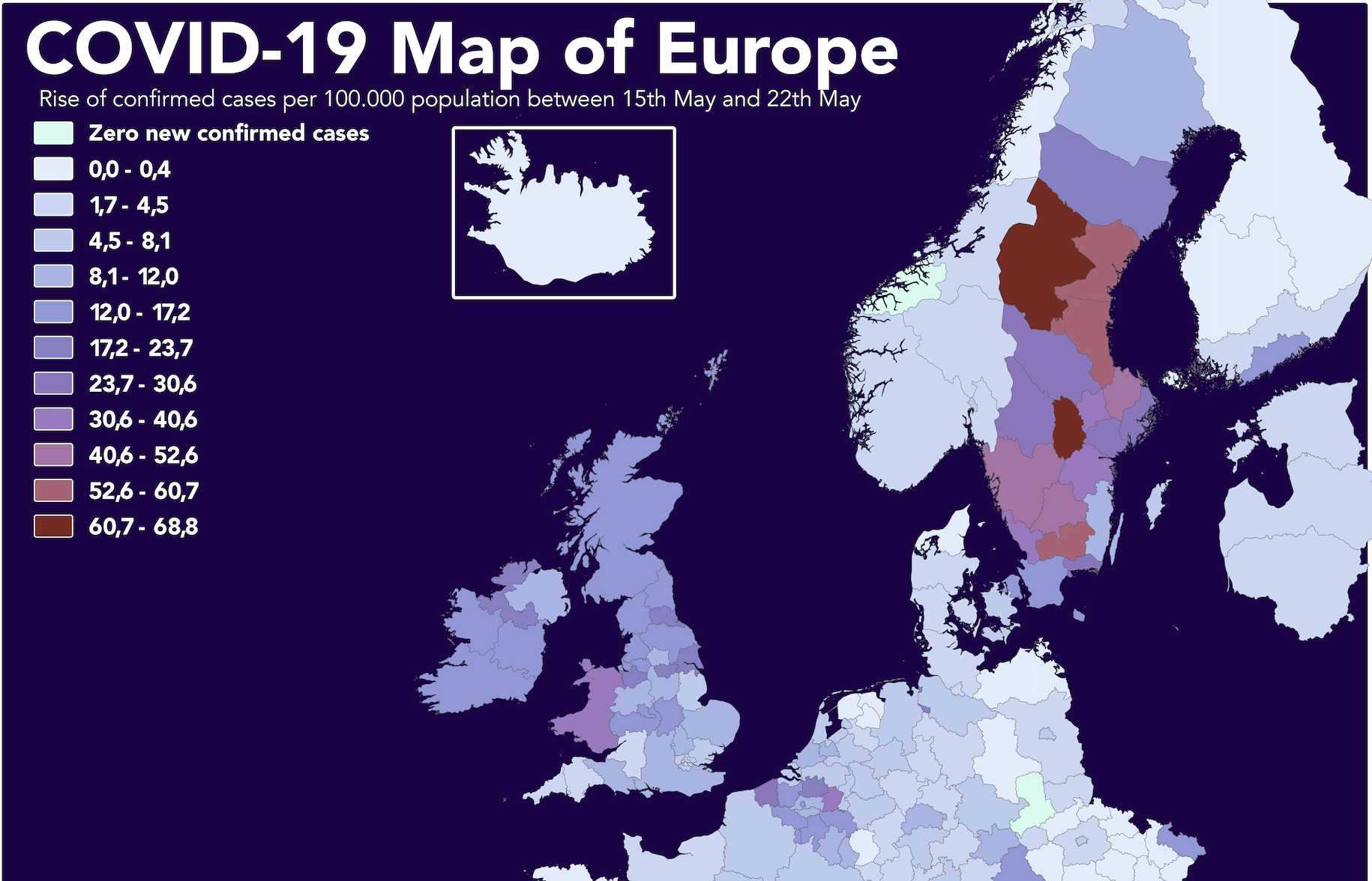
Swedish wave of sickness
The blue hues in Sweden are getting lighter and lighter. Although the Scandinavian country with its defiant corona policy was one of the least affected countries at the start of April, their situation is altogether different now. This process of ‘catching up’ is even more evident in the image below featuring just the new diagnoses in the period May 15 to 22.
Nevertheless, a certain degree of caution is warranted when drawing preliminary conclusions on the basis of diagnostic data from last week. Of course, Sweden has subsequently turned a deep red color, albeit that this is also in line with expectations. All this map really shows is that lockdown measures do indeed lead to fewer new diagnoses. But of the 25 regions where proportionally the highest number of new transmissions were reported in the past week, 16 are in Sweden.

Zero cases
Across the board, the number of new diagnoses has been falling steadily in recent weeks. The first wave seems to be almost over, although a second wave cannot be ruled out at all. On previous maps, Swiss cantons sometimes appeared with several tens of thousands of citizens without any new diagnoses. Yet these can now be seen in larger swathes of the country too. A prime example of this is Leipzig with just over a million inhabitants. And this is the case in Carinthia (Austria) and in the Norwegian Rogaland as well.
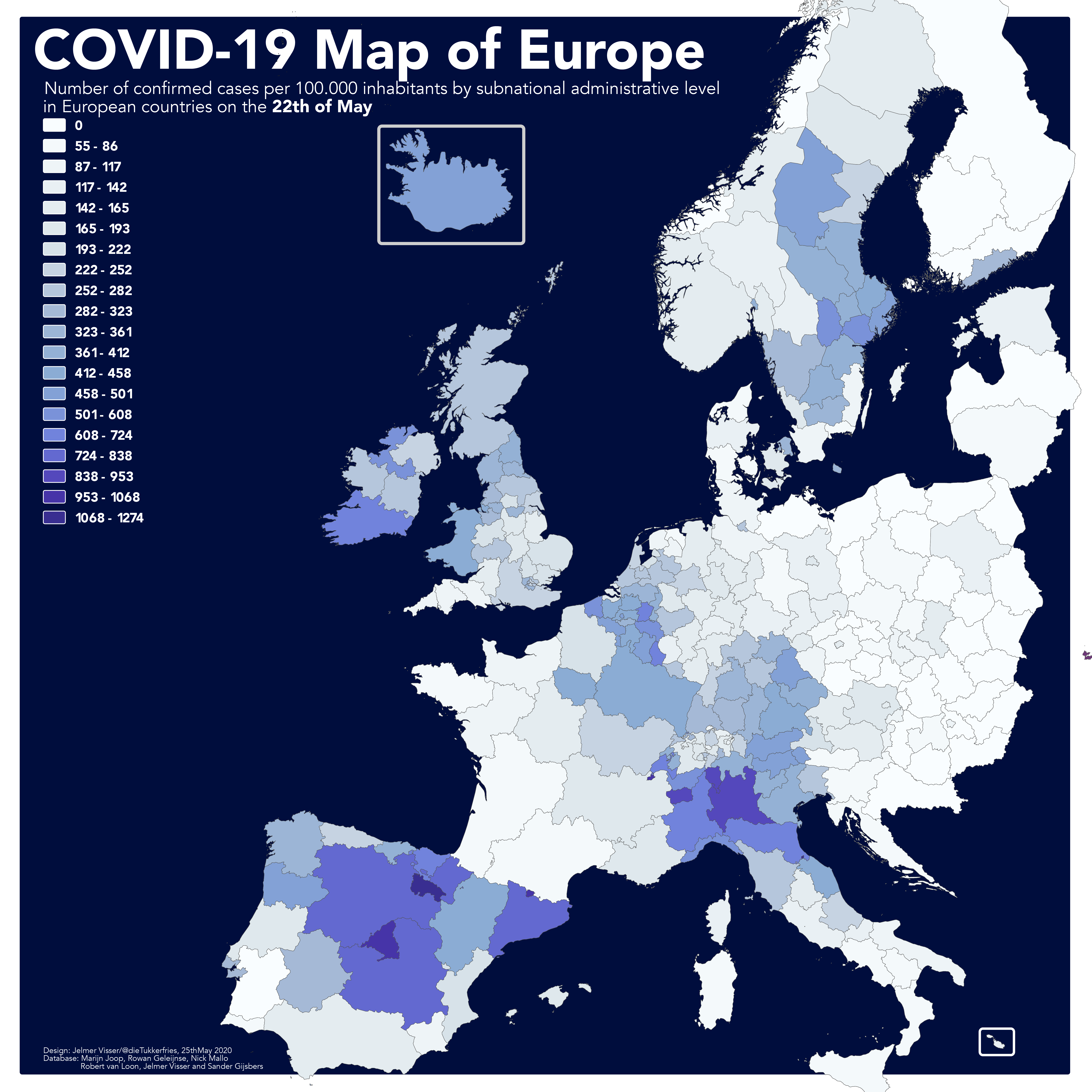
As one week is rather brief, the map below shows how things have progressed since April 30th. Here the ‘old hot spots’ like Spain and Italy are hardly noticeable anymore. However, numerous new corona patients are still being identified in Belgium, Great Britain, and Ireland, despite the restrictions. Central European countries, Scandinavia (except Sweden) and the Baltic States show the smallest increases.

Mortality
Another number included in these maps’ database per national region is the number of people who have died from the virus. Please note that only the numbers of patients who died in hospitals are included on this mortality map. The sole exceptions to this are Belgium and Sweden, which are the only countries in all of Europe who adds the number of people perished in care facilities or at home to their official death toll.
As a result, our southern neighbors are comparatively darker in color. In order to picture this for other countries, data on excess mortality rates on a subnational level is needed. At the moment this data is not yet available on a subnational level in most of these countries.

Ever-declining mortality rates
Over the past week, we have succeeded in preserving zero mortality rates in more areas, such as the Dutch provinces of Groningen and Drenthe, the Portuguese Algarve and Central Denmark. Austria, Switzerland, and the Czech Republic have the most regions without deaths. Remarkably; the country hardest hit by COVID-19 per capita – tiny San Marino – is also among the ‘green’ areas now.
On this map Sweden is admittedly exceeding the figures of its neighbors, but they are not the only ones. This is not so strange, given that fatalities tend to be counted with a significant delay in relation to the registered death toll. On average, this takes about 17 days. For this reason, deaths among those diagnosed in the past week will only become apparent in mid-June.
Would you like to find out how things are going for your region? Or do you want to use this data for your own research? Then check out the source database. This is accessible for everyone via Google Sheets, so anyone can use it however they want. Would you like to view more European maps? You can read last week’s story here.
Related Posts


