
In this column, we write about our best-read story of the past week. Often these were the stories written by Jelmer Visser with his clear maps showing the number of infections per European country. Visser published his last story last week.
Visser is not the only one who makes so-called open data visualizations. Marino van Zelst also posts daily on Twitter, immediately after the new figures from the National Institute for Public Health and the Environment (RIVM) known. He has over 21 thousand followers. Van Zelst’s posts feature a standard thread with Yorick Bleijenberg, who also posts daily and has over 12 thousand followers. Everyone has their own specialization. Some keep a close eye on the R Value number, others on the figures for the coronavirus in sewage water. What appears in visualizations is often a source for other media to interpret their own story.
As such, Visser’s maps are frequently cited in the corona debate. Not only by government officials, TV makers and the national press, but also by foreign media. Bleijenberg’s tweets about, for example, the expected effects of vaccinations on infection rates are also used as a source for other media. Dutch NOS broadcasting corporation, for example, used him as a source to suggest when an effect might be expected from new measures to counter a rise in the number of Delta variant infections.
Bizarre
Whether the work of Visser and Bleijenberg, among others, will lead to changes is hard to tell, but their findings do lead to a fuller understanding of what is going on in this crisis. Everyone looks with a different pair of eyes and presents the situation in their own way. Visser’s love of cartography made him the ‘map maker’ he is today. For Bleijenberg (36), it is the compulsion to be able to do something in this crisis. “I just like data and by doing this, I’m contributing something,” he says. For him, there needs to be even more open data. “Especially about vaccinations, there is no open data available on those. The fact that we can’t see differences between regions, municipalities and zip codes is something I find really bizarre.”
Information from our charts and maps does filter through, Bleijenberg contends, “but not directly. I make graphs of the different age categories. During King’s Day you saw a sudden surge in younger people in their twenties. That in turn gets picked up in the media.”
Like Visser, Yorick Bleijenberg started at the beginning of the crisis when the first data became available from the RIVM. “That was more to keep track of what was actually happening with the number of cases in the Netherlands. I compared that to the explosive surge in Italy.” Bleijenberg visualized the data and shared it with others. “They did find it interesting and I got some good feedback on it.”
Daily
Bleijenberg continued to make visualizations of the RIVM data and put the graphs on Twitter, @YorickB. The first one appeared on March 21. He also launched a website coronabeeld.nl. Where you can see, among other things, how vaccinations are progressing. How many first jabs and second jabs were given? What was the number of vaccinations per week? How many doses are still in the freezer? He takes a look at the vaccination effect: What has happened in nursing homes, hospitals and intensive care units since the vaccination and how many people have died?
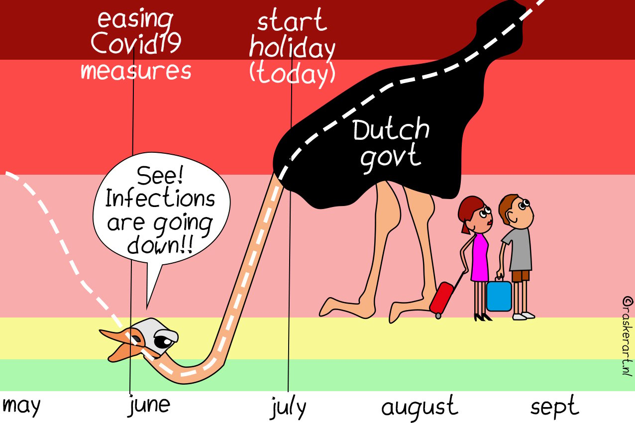
The RIVM comes out with a report each week, Bleijenberg publishes daily. “By themselves, daily figures don’t say very much, but if you show them in a structured way every day, then it is possible to say something meaningful about them.” As is the case with the advent of the Delta variant. The daily figures revealed an exponential increase, the amateur data analyst notes. “The RIVM barely communicated anything about that in the beginning. The RIVM compares from week to week, but you can also compare Sunday with the Sunday before, or Wednesday with the Wednesday before.”
Bleijenberg, among others, predicted earlier this week that the Netherlands would be heading for code red for other countries. On Wednesday, outgoing minister Hugo de Jonge asked the Outbreak Management Team (OMT) for advice. “You heard almost nothing about it from the RIVM,” he said. On Friday, measures were tightened up again.

Opinion
His visualizations of the daily figures are “super neutral.” These are computer scripts that Bleijenberg can generate at the push of a button. He takes a close look at the data to see what’s going on, gives them a title and puts them on Twitter. He doesn’t consciously place himself outside of a discussion: “I can have an opinion about it. But I mainly try to think about what the best visualization is. A discussion then arises about what we can seen in these. Everyone’s interpretation is different.”
In order to ensure that his visualizations are as neutral as possible, Bleijenberg submits them for scrutiny by his fellow data nerds, as he calls them. And he is part of the Red Team community, an independent expert group focused on the prevention and control of corona and Covid-19 in the Netherlands. “We actually talk about the numbers and about the trends on a daily basis. What we think is going on and how we should present that on Twitter. A sort of ‘sounding board’ group where you can think about things before you post something online. It’s nice to reflect on this with each other and interpret the daily figures. Just hearing other perspectives is also really nice.”
Visser is also one of Bleijenberg’s sources of inspiration. “Sometimes I get inspiration from his maps. Or I find it an interesting visualization, but then don’t go and do it all over again myself. He can do that much better than I can. And there’s no reason to do double work.”
Bleijenberg has a degree in molecular life sciences and works in customer service at Netflix. He analyzes the data in his spare time. “The advantage of the program I wrote is that you literally have the visualization at the push of a button.” Initially Bleijenberg worked with Excel, but this has now become a special software program for data processing. “The file you normally use to open in Excel became too big. Excel couldn’t stomach that anymore, so I started working in R. Other people work in Python, for instance.”
Applause
His website is also updated in an instant. He gets 5 thousand hits a day there. “That’s not a huge number by Internet standards but it’s a steady crowd that keeps coming back without any promotion on my part. It’s cool that people are interested in it.” People send him messages or donate money for his work. “That doesn’t happen a whole lot, but enough that I keep enjoying doing it for people. It’s often just a euro. But it still makes me feel a bit more appreciated than just a thank you or a round of applause.” Even though he consistently receives a Tweet every day from someone with ‘Thank you, Yorick’, “I really appreciate that, I love that person!”
Will he ever stop analyzing data? “Yes definitely, it’s just a question of when. I don’t dare say at this point. It’s a feeling that you have. Maybe when everyone is vaccinated and the numbers remain low. Once we’re through the winter. After that, probably the moment will come when you can say ‘it’s over’. At least for the Netherlands. But the pandemic is here to stay for some time.”
Right now it seems to be heading in completely the wrong direction. What if Hugo de Jonge, the RIVM and Rutte had taken a closer look at his and Visser’s work? Bleijenberg: “Yes, it is going the wrong way. They have the same data as we do. You can’t get any more out of that than the graphics that we make. They make decisions based on models. I don’t make models. Well, on beer mats maybe. I do have an opinion about it, but it’s more of a ‘pandemic feeling’ rather than actual hard data.”