


If all goes well, we will witness the last spring of the corona pandemic this year. If there are no major corona catastrophes on the horizon, vaccination coverage among the wealthier segment of the world’s population should be high enough in a year’s time to look back on the hallucinatory pandemic madness that kicked off the Roaring Twenties of this century.
That it will be over sooner rather than later is proven by the inoculation figures. A lot of countries went full throttle during the month of March. This is immediately visible in the race of nations that has been animated in the vaccination progress from the beginning. For example, Germany, Belgium, France and Austria, among others, are jabbing faster than they ever did in the past.
Is the Netherlands making up for the slump of the past few weeks in spite of the lofty promises made by Health Minister Hugo de Jonge? Not exactly. Warning: The video below is not suitable for fanatical Orange supporters.
Worldwide vax pecking order
If the Netherlands is to reach the promised 4 million jabs in barely two weeks’ time, capacity must go up to 100,000 a day and 700,000 a week. That’s around 200,000 more than that other “ambitious” promise that the corona minister came up with at the last press conference. Despite these hopeful words from a week and a half ago, the middle spot in the rankings that was within reach a month ago is further away than ever.
Now on from the Home Championships to the Premier League. Because the EU is just not the place to be when it comes to the fastest jabbers. Apart from Hungary which, with the help of Russian and Chinese serums, has managed to climb to eighth place in the jab rankings.
Chile and Morocco stand out in the top 10. Right between the rich Gulf States and the crafty trio that outbid the entire world during the procurement phase that culminated in a nerve-racking pharma soap opera that is still not over.

The faster the better
The concrete results of the large Pfizer trial in Israel now speak for themselves. In barely two months, they went from 8,000 infections per day and crowded hospitals to a couple of hundred and living without lockdown. And all that while “only” 52 percent of the population has been fully vaccinated.
That such a decline can become a reality even after just one shot of the Oxford vaccine, is something the United Kingdom seems to be demonstrating. However, it is currently in a heavy lockdown, which may give a slightly distorted or premature picture. Will other frontrunners such as the US, Chile and the United Arab Emirates move in the same direction this month?
Jabbing against the clock
It is still far too early in Europe to notice the effect of vaccination campaigns on a societal scale. Nevertheless, minor victories have already been achieved everywhere. For example, the number of infections, hospital admissions and deaths among the oldest age groups has fallen significantly since the beginning of the year. Yet this does not yet mean that the corona fire department signal ‘under control’ can be given while enjoying live music and a beer.
The more contagious British mutant virus that was announced with much fanfare in late December now seems to be living up to its infamous status. Whereas the current restrictions generally went far enough to curb the vanilla variant, this is now no longer the case at all. In fact, the “original” SARS2-nCoV has now almost been wiped out. The only problem is that its successor is even more odious..
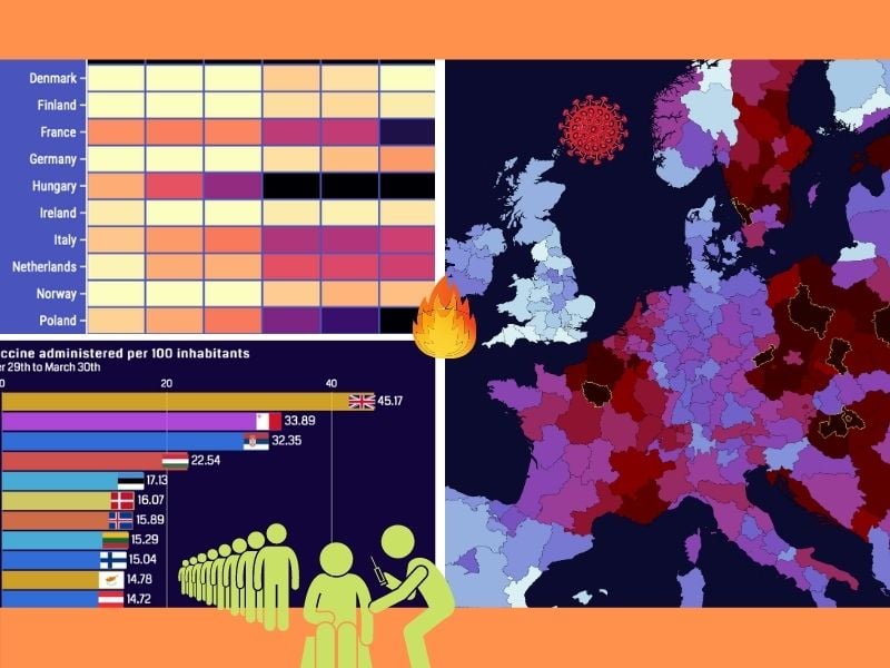
European corona maps at the subnational level were a regular feature of this IO column until last fall. On these maps, the differences and trends amongst European regions could be seen at a glance. Since the figures are now going through the roof again, the cartographer-cum-author on duty thought it was high time to take the ‘classic’ map version off the shelf again and give it a makeover.

Hot spot on the heat map
In order to be able to spot developments by week even better, this column will feature slider maps up until this fall. Given that this requires several recent examples, this kind of visualization is not possible this time around.
But with the following heat map illustrating the six-week trend in a number of Western European countries, the overall developments become more than clear. I.e., the British variant reveals that corona is under control almost nowhere. The more the colors shift each week, the greater the cause for concern. In the Czech Republic, the wave of infections that started this fall has actually never ceased.
Proportion < number of positive tests
But what do these macabre infection rates matter when the most vulnerable part of the population has already been vaccinated? A lot. If a stealthy – mostly invisible – disease like COVID-19 spreads widely and exponentially enough, hospitals will eventually fill up with critically ill sixty-somethings. Which means Code Black is liable to once again clamor for ICUs, with dire consequences.
Ireland, Portugal and Slovakia have all demonstrated that the coronavirus can severely disrupt healthcare even at this stage. Infection figures do not say everything about the epidemiological situation. That is why the Our World in Data map with the proportion of positive tests can be rewound from one week to the next for a more complete overview.
Correlating these numbers to the infection rates and trends on the heat map, the outlook for April in countries such as Poland, Hungary and, to a slightly lesser extent, Sweden, appears to be the most unfavorable. Spain, after last year’s two relentless full-blown viral outbreaks, seems to have escaped the brunt of the storm for the time being.
In order to stomp out the fire on our own Dutch soil, the proportion of positive tests should never exceed five percent. That’s according to the guidelines from the WHO.
Last of the tough lockdowns
Not only has the corona crisis made a deep dent on hospitals, but societies are becoming increasingly more impatient when it comes to complying with the corona rules. It is all taking an awfully long time. Yet the figures from Israel prove that the end is now truly in sight.
The sooner we vaccinate and abide by the basic rules, the sooner things can be lifted. A few more months of keeping the transmission rates low through repressive measures – then a summer with a vaccination passport in our pocket should be on the horizon. And all that without the nasty viral vacation souvenir that has left us saddled with this huge problem.
One way of doing it – keep the rates artificially low until we get vaccines to do their job. But how? That varies enormously among dozens of governments. Some go for a curfew, others see more in travel restrictions. Should quarantines be mandatory and which sectors are allowed to keep their doors open? Opinions on this differ quite a bit.
Based on seven yes/no questions, the chart below shows how things stand at the beginning of this April. Croats and Fins have the most freedom, according to Re-Open Europe, while Irish and Greeks are practically not allowed to leave their homes at all.
The drop-down menu enables you to compare the choices in terms of curfew, travel restrictions, public indoor spaces, contact professions, places of worship, non-essential stores and quarantine obligations plus any fines. And as is the case with epidemiological figures, no two countries are alike.
Related Posts


