

The coronavirus has been gripping Europe at an unprecedented – but not yet murderous – rate since schools started again. The first full week of September was marked by unprecedented diagnostic peaks in almost every country.
How bad was it? So bad that the legend of the corona map had to be changed. In Croatia, the Czech Republic and Hungary, the previous 24-hour records of infections died down. In France and Spain it was even worse: 10,000 and 12,000 new infections were added in 24 hours at the end of last week. Such huge coronavirus increases are even worse than the ones that occurred in spring.
Nevertheless, the situation today can hardly be compared to that of March and April. The number of deaths and infections is much lower and a lot more testing is taking place. How exactly should we interpret the situation? That is the purpose of this article: Interpreting Coronadata 101. Don’t worry, it’s less boring or complex than it sounds.
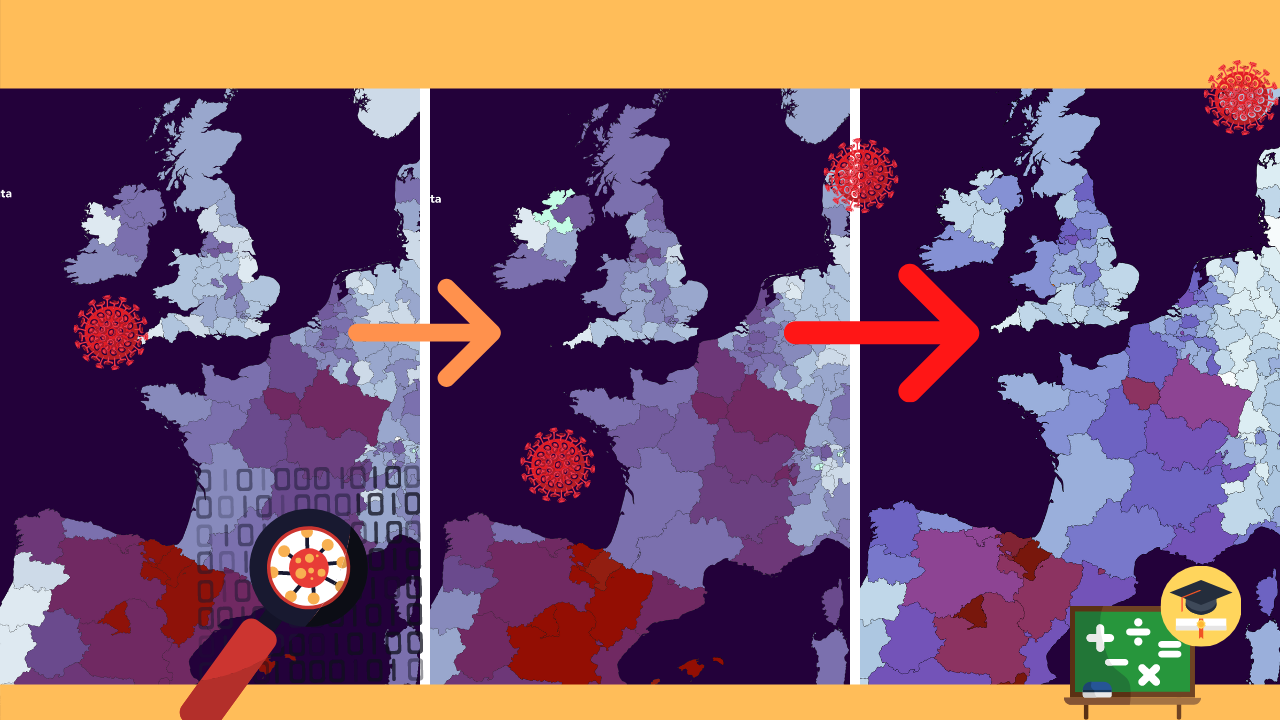
To start with, here is the latest weekly map of Europe. On the sliders below we compared 5 to 12 September with the situation of two weeks ago and the first week of August. The trend is quite clear.
New pandemic chapter
The sliders show an image that has become very familiar: The number of infections is increasing across the entire continent and there seems to be no end in sight. Is this the beginning of that dreaded autumn peak?
In the United Kingdom they think it is. As of Monday, it is forbidden to gather in groups of more than six people throughout the country. This rule also applies to restaurants, stores and gyms.
This autumn, Central Europe doesn’t seem to be evading the problem to the extent it was at the beginning of the year. The Czech Republic is now one of the largest corona hotspots in Europe and Hungary is also struggling with unprecedented steep climbs. Poland, Serbia and Denmark are the only ones to show a steady decline.
The numbers are now so high that the weekly corona map needs to be updated. The current scale and color distribution has been adjusted to the situation in June when the growth numbers were much lower. Since these figures are expected to remain on the rise for some time, the European map has been upgraded to be ready for the new pandemic chapter.
The limit values have been raised and have been rounded off. In addition, the contrast and saturation of the color palette has been increased so that the different regions the countries are more distinguishable from each other. The result is shown below.

What does it mean?
Based purely on the infection rates and increases, you would expect the whole of Europe to be in the middle of a second devastating spring-like situation. Yet the intensive care units and crematoriums are (still) empty. How is this possible? The answer: testing capacity.
Because a lot more is being tested now for COVID-19 than six months ago, it is quite logical that more people will be diagnosed with the virus. In March the test capacity was almost nowhere up to standard. Because the coronavirus affects a considerable number of especially younger patients practically without symptoms, the lion’s share remained under the radar at that time. As a result, vulnerable target groups such as the elderly ‘suddenly’ became very seriously ill.
How great is this effect? There are estimates that six months ago, perhaps as many as 90 percent of corona patients were never officially diagnosed. To measure the severity of a pandemic, it is quite practical to know who is ill and who is not. That’s what you can accomplish with testing. The nasal swab champion of Europe is by far Denmark. The Our World in Data below shows the weekly average of tests taken per 1,000 inhabitants in 12 European countries.
Test, trace, isolate
But testing alone will not do the job. To prevent a new disaster scenario, the rule of thumb of test, trace, isolate is essential. By adequately testing you can map the pandemic situation. Contact research – either through people or via an app – ensures that the contacts of a corona patient are identified. Self-isolation should prevent the patient from transferring COVID-19 to others. But the basis lies in adequate testing.
What constitutes enough testing? The WHO defines this with a threshold of 3% positive tests. If more than 3% of nasal swabs are positive, this is an important indicator that there is not enough testing being carried out. At that moment, the likelihood that new lockdowns – which no one wants – will have to be instituted to stop the spread is very real. On the other hand, mass testing is of little use if hardly anyone is carrying the virus. As a result, the percentage and development of positive tests gives a picture of the situation that is at least as accurate as infection rates.
Our World in Data also shows this data on the map. Below you can see the percentage of positive corona tests. With the slider you can also see how the percentage of positive tests was many times higher than it is now. This effect becomes even clearer with the graph below. Here the info on the map is linked to the increase in infections.
Few tests, much misery
Many countries exceeded the 3% standard in September. Every effort must be made to keep the spread of the virus under control so that the most vulnerable group of patients, the elderly, is not faced with an assassin in the form of patients with mild or no symptoms.
In the Netherlands last week, 2.8% of corona tests were positive, just shy of the 3% threshold and many times lower than the sky-high 26% at the beginning of April. However, this number should not increase any further. Spain seems to be the first country to have lost control: With 11% positive tests, they are (again) the highest in the EU. The Czech Republic and France should also be concerned. For the time being, the Baltic States, Scandinavia and Germany have the least cause for fear of the virus. There less than one in 100 samples taken last week contained SARS-CoV-2.
Infection figures are by definition incomplete. After all, it is impossible to locate every COVID-19 patient. An established diagnosis requires a positive test result, but if those test results are not available, the number of new patients in the system also remains low. Therefore, this percentage may say more about the pandemic in the here and now than diagnosis figures. In the Netherlands, the RIVM releases this percentage every Tuesday in its epidemiological report. Presumably this week the 3% threshold will be easily exceeded in view of the rapid advance and the capacity problems in the test lanes.
So where do ‘we’ stand? Not as good as in July, but much better than in March. This can be seen in the last important indicator of this article: the increase in the number of deaths. In the graph below, these have been put on a logarithmic scale so that the difference with spring remains visible and the new peaks in France and Spain can be seen. The situation is absolutely not comparable for now, but this number has been increasing steadily since August.
Autumn days of truth
The coming weeks will be very challenging for Europe. Since we have no comparable scenario to measure it against, it remains guesswork as to exactly how many infections will be needed to once again overburden healthcare systems and trigger increased mortality. There is a chance that things will get out of hand again, but there are also restrictions in place to prevent this. And although there is no vaccine or drug yet, doctors have become increasingly adept at keeping seriously ill corona patients alive and significantly shortening their stay in the hospital.
Identifying a pandemic remains quite difficult given the lack of comparable scenarios. However, the combination of relative growth rates of infections with the percentage of positive tests and mortality provides the most leverage if you want to compare countries. Since the entire world is facing this disaster in 2020, it is very possible to compare different countries side by side.
But this is not happening very often. Many news media continue to focus on daily rates, domestic figures that don’t really say much at all and those whose vacations fell through because of corona.
To conclude Interpreting Coronadata 101, let’s take a look at a few examples of mediocre corona information in hypothetical news headlines.

Persona non data
“In the United Kingdom, a total of 368,504 people are infected with the virus.” What a high number – that’s about as many inhabitants as Utrecht! But it doesn’t say anything about the current situation either. Because the coronavirus has been disrupting mankind for half a year now, cumulative data are virtually useless. Someone who became infected in March – apart from a few re-infections – is currently no longer a corona patient. He is a ‘closed case’ which can mean either cured or deceased.
If you want to interpret the current situation, you’d be well advised to look at the number of infections in the last fourteen days, preferably per capita. After all, 368,504 (ex)-corona patients in Spain is a completely different story than the same number in Utrecht. This would mean that every Utrecht inhabitant would (have) been infected, something that will not happen with the coronavirus because it is simply not contagious enough.
Another example! “France and Spain reported record increases of 10,000 and 12,000 new infections in 24 hours!” Yes, the undersigned wrote this in the first paragraph of this story. Such absolute numbers work well in news headlines. However, they say nothing about trends. Such numbers sound alarming, but if only a few dozen cases were added in the preceding days, the moving weekly average is not so bad. Nor can it be ruled out that perhaps as many as five million people were tested in a day. Nothing wrong? Yes, there is. Based on the maps, you could see that the percentage of positive tests, infections per 100,000 inhabitants and mortality are also on the rise. All reason for appropriate caution.
For those who want to see even more interpretation, data and maps, the site of Our World in Data is a relief. It is ideal if you are looking for information about the pandemic without opinion, political interests or PR talk. Even people without a statistical bent should read their COVID-19 introduction. In addition to the visualizations in this story, they have dozens of other maps, charts and analyses on a global level of viral sidelines that you never thought you would want to explore. For example, they offer the strictness index of anti-corona rules per country, offer tips for daily life and the maximum recommended number of attendees at parties and celebrations.
This is very practical for those who want to make the most of their fresh home-virologist knowledge and would like to know how many people the conversation can consist of and what it’s all about.
Related Posts


