

The ‘corona vacation’ in Western Europe lasted about a month. After most countries opened up again in early June, all of the corona misery in the news headlines took a back seat for a little while. By mid-July, the virus was back in the news in and around some places. Six weeks later, COVID-19 is back on the menu almost everywhere.
Last week’s corona update focused on the uncertainties ahead for the upcoming autumn. This week we look back on the summer vacation when between most EU countries was allowed to resume.
However, let’s start with last week. How was the third week of August in terms of increases in positive corona diagnoses at the subnational level? The answer to this can be seen on the following weekly map of Europe which illustrates the increase in the number of positive diagnoses per 100,000 inhabitants.

Holiday fun or new corona wave?
This week, the number of infections on a continental level is on the rise once more. Spain seems to be caught on the ropes where the blows are hitting hardest after this southern European country was already hit much harder than other countries last spring. It is also where the economic malaise is at its worst across the whole of the European Union.
The north-eastern Spanish region of Aragon is once again the place with the largest relative increase recorded in one week. The 3,254 infections per 1.3 million inhabitants counts for an increase of 246.6 per 100,000 inhabitants. Madrid went up by 12,000 and has now registered a total of more than 100,000 infections.
The tiny landlocked country of Moldova plus the Belgian city of Brussels are the only two non-Hispanic regions who have landed back in the higher figures. The Belgian capital seems to be the country’s new hotspot after Antwerp was at the outset of this month. A total of 936 new cases were added, amounting to a relative increase of 77.4.


No summer pandemic spike
Eastern Germany, South West Italy, South West England, and Hungary feature heavily at the bottom of the list of more than 300 regions where we have collected data. It is worth noting that in many cases, these are the same areas that were not hit so hard earlier this year.
In Western Europe, it is the Dutch province of Drenthe where the number of infections has appeared to remain the most manageable. Whereas the wee Swiss canton of Nidwald (43,000 inhabitants) was the only part of that country with no new infections recorded over a seven-day period. Hungary is bravely standing its ground in Central Europe when we take a look at the whole country. This is in contrast to its neighboring countries, which in the past often ended up on the bottom of the list.
Of course, infection curves do not tell the whole story. If you test a zero number of people, the number of infections will also be zero. In order to reveal the full picture, the following is the map from Our World in Data where (progression of) the prevalence of positive tests over the past week is highlighted.
‘Keep below 5 percent’ – WHO
Spain, Romania, and Croatia have unfortunately exceeded the WHO 5 percent standard. This signal is also beginning to emerge in the Netherlands, the Czech Republic, and Poland. The trend seems to be fairly obvious. As a matter of fact, blue colors are turning orange or even red all over the place.
What is particularly noticeable is the redefining of the United Kingdom, which was the last country in Western Europe to introduce restrictions in the spring and at the time was also one of the countries with the lowest levels of testing and also where the catastrophe was the most serious. In the meantime, the UK National Health Service (NHS) seems to finally have its testing capacity up and running. With the exception of a few local hot spots, such as Leicester (northern England) or Aberdeen (Scotland), the British are also well below European averages at present.
Last but not least, the countries that suffered the fewest blows last spring in terms of infections and mortality rates: Germany, Norway, Denmark, and Finland – are yet again the places with the lowest percentages of positive tests. Use the slider to check how these percentages have progressed over time.
In order to also be able to compare the situation with the past in terms of infections, the charts below with sliders feature the latest European map next to last week’s maps and those of five weeks ago. By using the slider you can immediately see where the corona hot spots have flared up the most this summer.
Ban on viral vacations in Baltic bastion
Among others, Poland, Germany, Denmark, and Switzerland are on the rise, whereas the spike has become a kind of plateau in the Benelux, with more or less the same number of infections being reported every day.
France and Spain present the largest increase across the board. Could this have to do with the fact that these two countries are also the most popular summer holiday destinations in Europe? This would seem to be the case. Especially since other popular destinations for a sunny vacation, such as Greece and Malta, also share above-average infection rates. Italy, where it has been relatively quiet so far this summer, is also slightly on the rise.
During February, it was the spring or winter vacations that spread the virus across the continent. Is something like that happening again this summer? In Germany, the Robert Koch Institute reported that 40 percent of all new infections were most likely linked to a trip abroad. Kosovo and Turkey were especially over-represented in these figures. In the Netherlands, the National Institute for Public Health and the Environment (RIVM) stated that this attributed to almost one fifth of the cases. A relatively large number of people became ill after a stay in France, Spain, or minuscule Malta. It should be noted that for more than half of that total number, no known source has been identified at all.
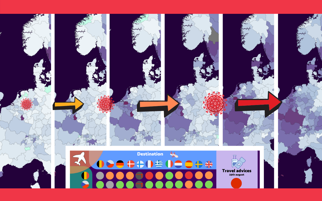
That infections often originate from abroad is revealed in the ever-changing separate rules and regulation and travel advice that each country stipulates for themselves. How do these countries assess each other? In the table below, the travel advisories of twelve countries as departure countries are compared with the same group as travel destinations.

Strict door policy, less foul play
The coronavirus spread throughout the world at the beginning of this year thanks to international air traffic. Exactly how large this role is, is still under investigation. But that aviation constitutes an important pandemic gateway on a global level is indisputable. Right now, the French, Greek, and Czech governments are upgrading their travel advisories the least. Iceland has even decided not to allow any more visits from across the border. However, given that this island nation is not really like any other of the larger EU countries, this is much easier for them to realize.
Finland has the strictest travel policy of those twelve countries. The list of passengers from countries that are still being welcomed is dropping steadily by the week. No mandatory quarantine is in force, as in a lot of cases you simply cannot even enter this Scandinavian country without a very, very good reason. The Baltic States also have a very similar system whereby there are more countries blacklisted than not.
Whether this closed gateway is also the cause of the low number of corona diagnoses in the north eastern corner of Europe seems quite plausible. The full effect of summer vacations will become clear in the foreseeable future.
Yet this is not the first time this particular foursome has stood out. Because Germany, Norway, Denmark, and Finland also seem to be the best where tackling the crisis in that one other very important respect is concerned. The map below shows the economic downturn in the second quarter.
It seems that the ‘summer champion’ on the pandemic scale most likely uses Eastern European Time.
Are you missing a country or would you like to know more about specific restrictions or regulations? Through the Re-Open Europe project, the EU is endeavoring to bring order to this myriad of travel advisories. Chances are that the travel advice graphs will already be outdated within a few days.
The complete database which we used to create the weekly maps can be found via this link. Handy for true cipher fanatics or those who are working on their own corona projects. This free data can in principle also be used for any purpose without explicit permission. Mentioning my team as a source, however, would be much appreciated.
Related Posts


